Sushi J - Food delivering app
The problem
Users face challenges with complex navigation, inconsistent menu information, cart management, vague delivery time estimates, limited payment options, a lack of personalization, and inadequate user support. The goal is to improve the app’s overall user experience to make it the top choice for local Japanese cuisine delivery.
To comply with my non-disclosure agreement, I have omitted and obfuscated confidential information in this case study. All information in this case study is my own and does not necessarily reflect the views of SushiJ.
My role
I was introduced to this project at its very early stage. As an only UX/UI designer my role was to research the user need, identify the pain points, find out the best solution, test and deliver to the development team.
Initial stage I worked with the stakeholder and chief technical officer to fully understand the current stage of the user need. Later on, led the research, prototype and design guidelines.
User interviews
1. General Usage and Preferences:
– How often do you use food delivery apps?
– What do you like the most about using such apps?
2. Navigation and Menu Exploration:
– Can you describe your experience while navigating the Sushi J app and exploring the menu?
– Have you ever encountered difficulties finding specific dishes or sections in the app?
– What improvements would you suggest for making menu navigation more user-friendly?
3. Menu Information and Decision-Making:
– How do you typically decide what to order from the Sushi J app?
– Do you feel the menu provides enough information about the dishes, including descriptions and images?
– What additional menu details or features would assist you in making informed choices?
4. Cart Management and Ordering Process:
– Have you ever faced challenges when adding or removing items from your cart or making modifications to your order
5. Can you share your experience with reviewing and confirming orders in the app?
– What improvements would enhance the cart management and order placement process?
6. Delivery Time Estimates:
How important is it for you to have accurate delivery time estimates?
Have you experienced issues with delivery time estimates on the Sushi J app?
What suggestions do you have for improving the delivery time estimation process?
7. Payment Options and Convenience:
What payment methods do you prefer when using food delivery apps?
Do you find the available payment options in the Sushi J app sufficient and convenient?
Are there any additional payment methods you would like to see integrated into the app?
8. Personalization and User Profiles:
How would you feel about having a user profile in the app with order history and favorite dishes?
Do you wish the app offered personalized recommendations based on your past orders?
What kind of personalization features would enhance your experience with the Sushi J app?
9. User Support and Assistance:
Have you ever needed to seek assistance, provide feedback, or report an issue in the app?
What support options or features would make it easier for you to resolve any concerns or questions?
Can you share any experiences related to user support within the Sushi J app?
Persona
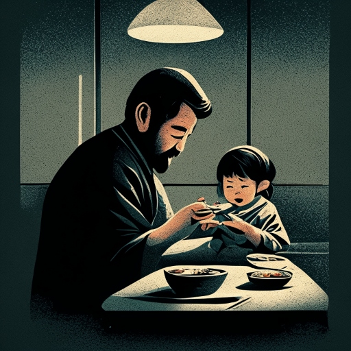
Maria
Background: Maria is a tech-savvy individual in her early 30s who works long hours and often orders food for dinner. She enjoys trying different cuisines and has a particular affinity for Japanese food.
Needs and Goals: Fran seeks convenience, quick delivery, and a wide variety of Japanese dishes. She values an easy-to-navigate app and personalized recommendations to explore new menu items.

Olivia
Background: Olivia is a college student in her early 20s who occasionally treats herself to restaurant delivery. She’s not very familiar with Japanese cuisine but is open to trying it.
Needs and Goals: Olivia wants a user-friendly app that provides detailed menu descriptions and images to help her make informed choices for the occasional Japanese meal.
Fred
Background: Fred is a father in his late 40s, and he often orders food for his family. They enjoy Japanese cuisine for family gatherings.
Needs and Goals: Fred requires an app that allows for large, customizable orders. He values clear delivery estimates and ease of payment to ensure a smooth experience for his family.
User story
As a user, I want to easily find and explore different sections of the Sushi J app so that I can quickly locate my preferred Japanese dishes and explore new options.
Acceptance Criteria:
The app should have a simplified and intuitive navigation menu.
Users should be able to browse and filter menu items by categories, such as sushi, sashimi, or rolls.
As a user, I want to see detailed descriptions, ingredient lists, and high-quality images of dishes in the Sushi J app so that I can make informed choices, especially when trying new Japanese dishes.
Acceptance Criteria:
Each menu item should include a description, list of ingredients, and at least one high-quality image.
Users should be able to access nutritional information for healthier choices.
As a user, I want a user-friendly cart management system in the Sushi J app, allowing me to easily add, remove, and customize items in my order.
Acceptance Criteria:
Users should be able to add, remove, and adjust quantities of menu items in the cart with a few simple taps.
A clear order summary and estimated total should be visible at all times.
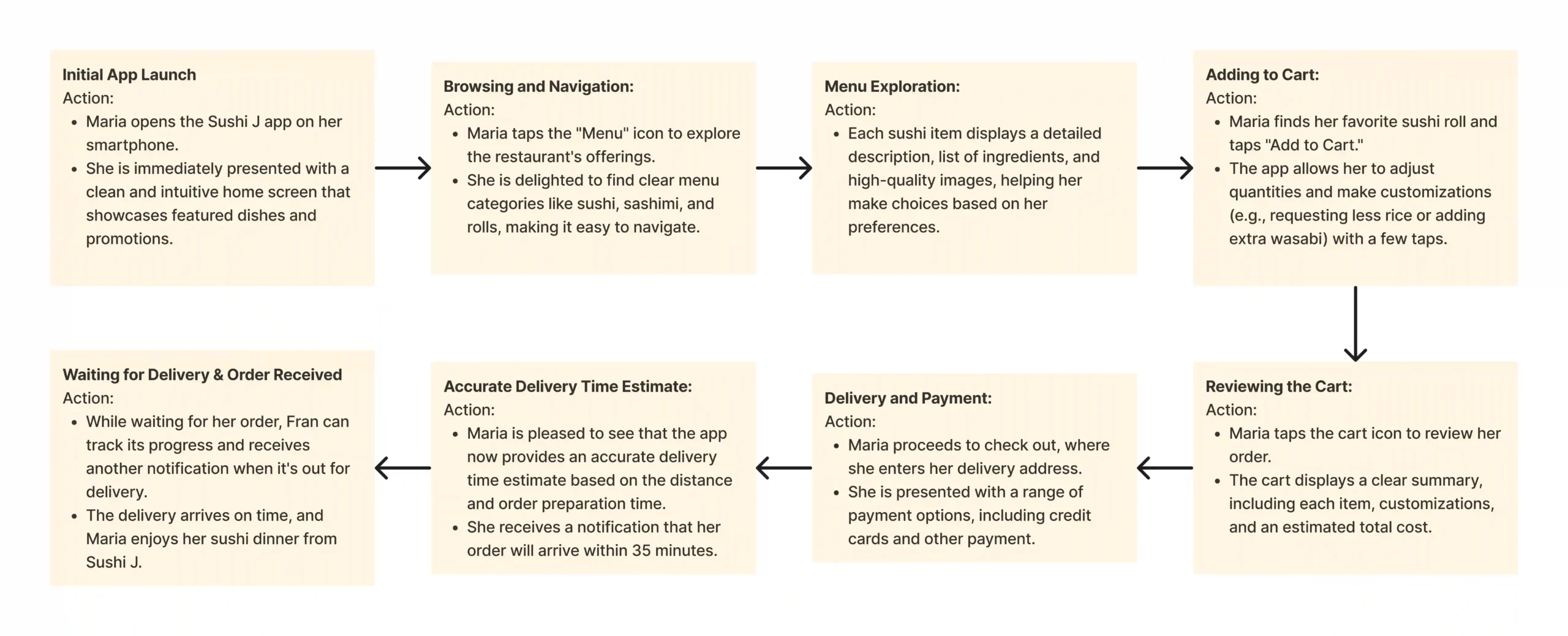
User journey
I created a user journey map just to understand the user’s actions at different stages. It helps to create an obstacle-free path for the users and identify improvement opportunities. As the app was in a state of redesign many features were needed at discovery.
The solution
After the long-scheduled work on finding the problem and defining it, it was then come down to finding the solution. At first, I gathered some hypotheses to generate ideas in order to solve this. Later I linked the ideas to the personas to solve their problems
Hypothesis Statement
We hypothesize that by simplifying and streamlining the app’s navigation, users will be able to find their preferred dishes and explore new options more easily. This will result in increased engagement with the menu and higher order placement rates.
We hypothesize that by providing detailed descriptions, ingredient lists, and high-quality images for each menu item, users will be better informed and more confident in their choices. This will lead to an increase in order accuracy and a reduced likelihood of returns or cancellations.
Considering the human factor
Though there were many things that were inline with the research outcome I had to keep in mind the human factor that often occur in user experience such as impatience, limited memory, needing analogies, limited concentration, needing motivation and making errors.
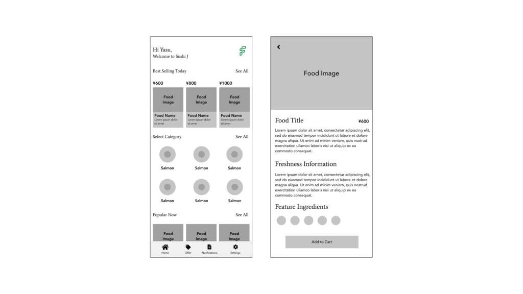
Wireframing
After getting feedback with my stakeholders and project manager I have decided to build the wireframe to give more look and feel of the initial look that I will propose. I made some research on site like behance, dribbble, real products page etc.
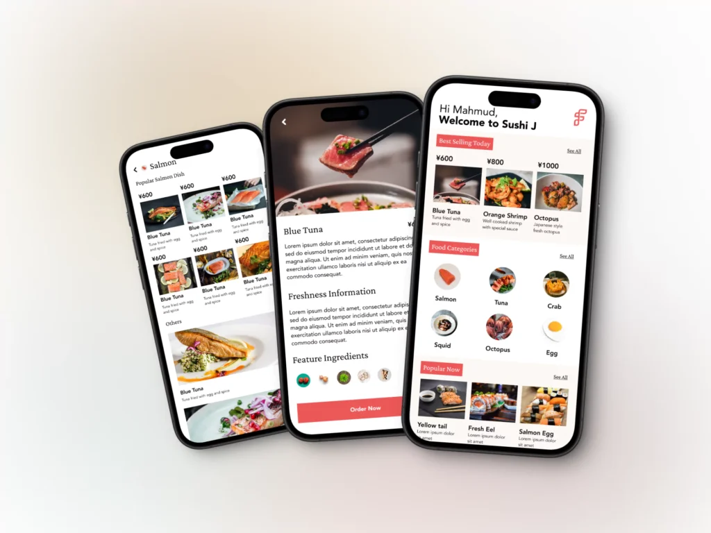
High fidelity prototype
After careful consideration on the user need and feedback from the team member from the wireframe and low fidelity prototype, I have tried to extract down to the high fidelity where we can have real feel and look of the finished product.
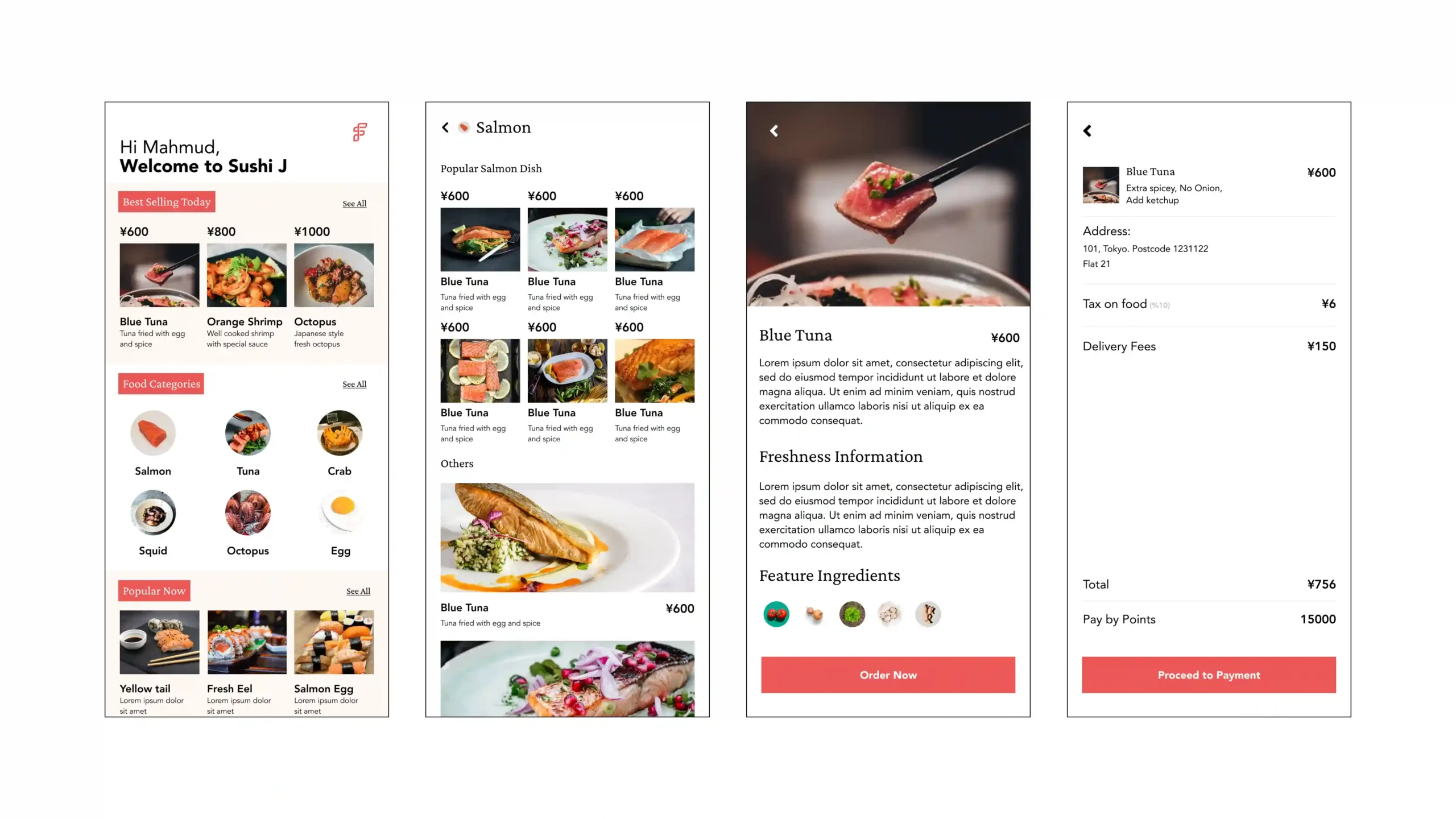
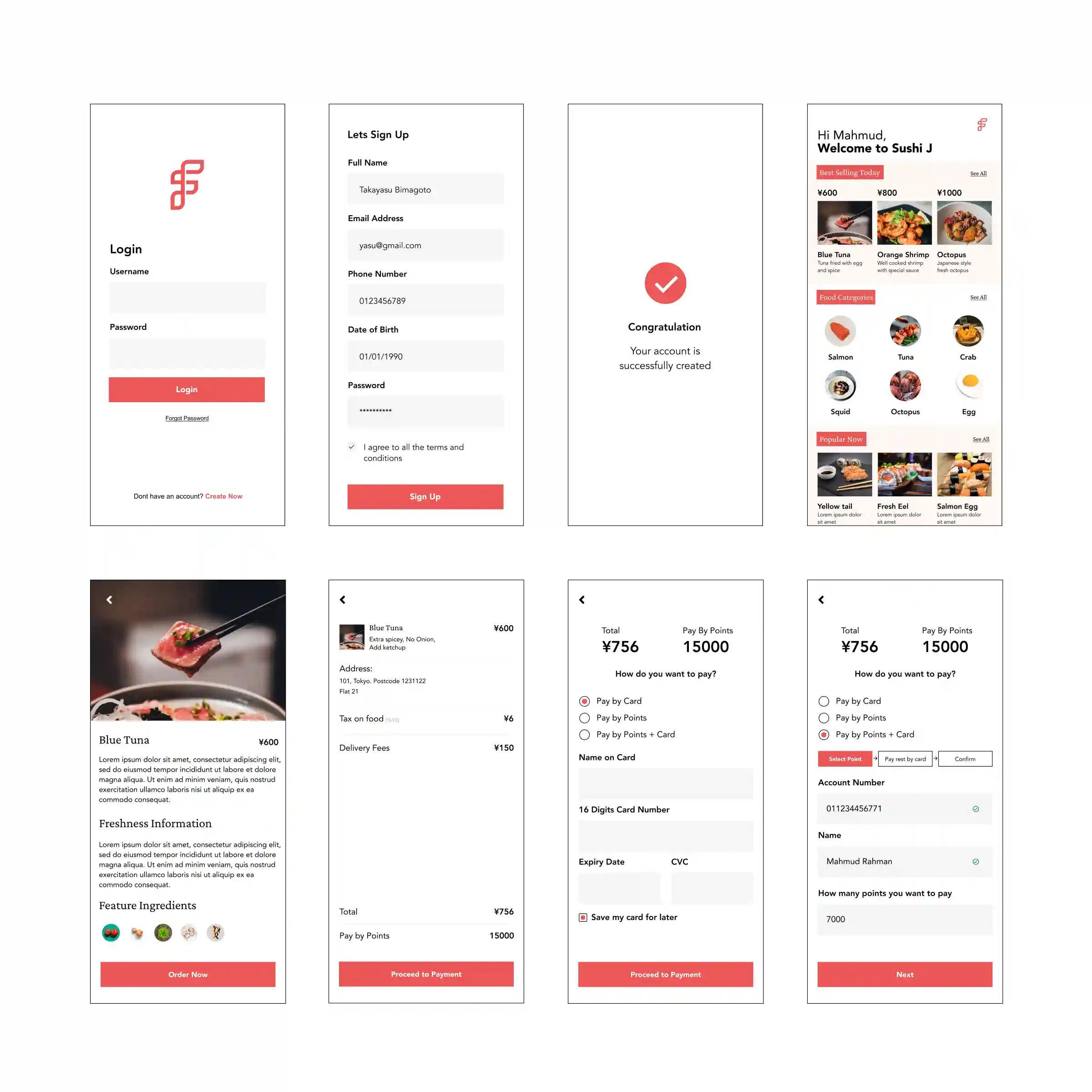
More screens from the app
Testing the product
In order to test the product we tested out beta version with some volunteer user group. The test was conducted based on questions that we created in prior. Few of the questions are provided below:
1. What is the first thing you see when you login to the homepage?
2. What is the first thing you do after entering the login page?
3. How do you feel about it?
4. Can you log in time for the project easily?
5. On a scale from 1-10 where 1 is difficult and 10 is extremely easy, how would you rate the overall experience?
Key Performance Metrics
At first I listed down the KPI’s that I thought would be useful to achieve the goal. Here are those:
1. Time on task: It measures how long it takes for a user to complete a task. Example: in our project I asked a user to make an order seemlessly
2. Use of navigation vs. search: It indicates the number of people who use the app’s navigation, compared to the number of people who use the search functionality. There is no right or wrong answer here, I tried to understand the nature, how many users uses the navigation and how many of jumps straight to search.
3. User error rates: Indicate the parts of a design that cause users to make errors. I tried to find out how many times the user clicks the wrong button or navigate the wrong area of the design or any of the design part is misleading to them.
4. Conversion rates: Any time a user successfully completes a task, meets a goal, or makes it to the final destination of your product, it’s a conversion. I tried to find out the ratio of a user completing a micro task and complete task.
5. System Usability Scale (SUS): Sets of questions that asks participants their opinions about your product. I set out questions to find out the overall experience of the design.
Conclusion
After testing for a week in different ways, we were happy to send it to the developers. This project was a great experience, starting from the research phase until it was ready for development. During the project, I learned more about the product, found out more about what our users struggle with, and realized how important each small change can be.
N.B. If this project seems interesting and you are keen to know more drop me an email at mahmud.khairul@gmail.com and I would love to share my practical experience which would benefit to your product journey.