Proteus is a cross-company project management SaaS (Software as a service) product. It is often used in the energy industry to manage big opportunities, projects, proposals, contracts and resources. Users are heavily dependent to look into the project progress, metrics and financial data at Proteus. However, the client’s homepage was redundant, ineffective and visually boring.
I was asked to recreate the experience by implementing more useful elements that the users frequently use and beautify the page by giving it more flavor of the product branding.
To comply with my non-disclosure agreement, I have omitted and obfuscated confidential information in this case study. All information in this case study is my own and does not necessarily reflect the views of Proteus.
My Role
I was introduced to this project at its very early stage. As an only UX/UI designer my role was to research the user need, identify the pain points, find out the best solution, test and deliver to the development team. So I had to put multiple hats during the project. I would call my role as Solo product researcher and designer.
Initial stage I worked with the stakeholder and chief technical officer to fully understand the current stage of the user need. Later on, led the research, prototype and design guidelines.
Solution
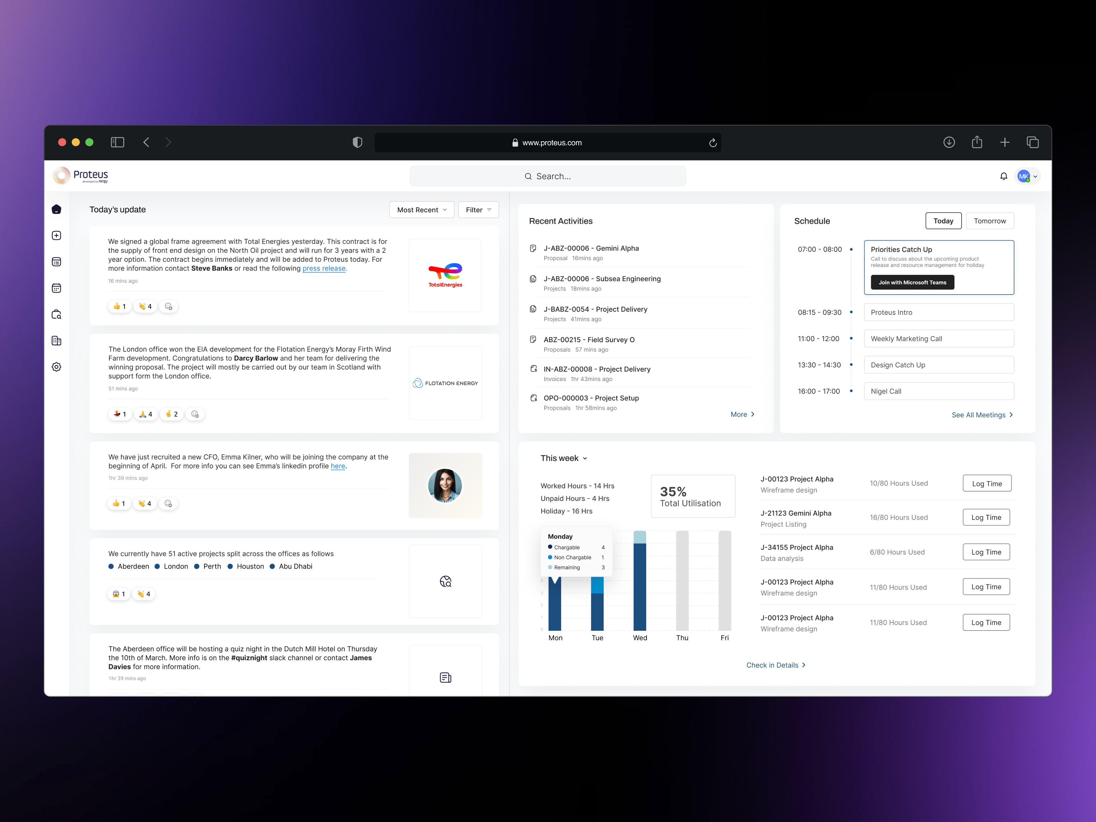
The project aimed to design and launch a new homepage which solves all the user’s painpoint. One place which will give an overview of the user’s activity with broader opportunities.
Platform
Web/Desktop
Before vs After
My approach in summary
My role
I was introduced to this project at its very early stage. As an only UX/UI designer my role was to research the user need, identify the pain points, find out the best solution, test and deliver to the development team.
Initial stage I worked with the stakeholder and chief technical officer to fully understand the current stage of the user need. Later on, led the research, prototype and design guidelines.
User interviews
As the project was quite in early stage I had to dig deep to understand more about the problem. I conducted interviews over zoom on our existing users and stake holders to gain more insight.
Interview Goals
1. I want to understand common perception clients have when they log in to the current in homepage 2. I want to identify the need people feel that they wish they could have on the homepage
Interview Questions
1. Can you describe your current usage pattern of the homepage after you login to Proteus? 2. What are the most common things you use on the homepage and how often do you use them? 3. What comes to your mind when you use it and what are the things you wish you could have on the homepage? 4. Is there any way in which you feel these challenges could be resolved? 5. What are the things you think are missing that would add a great value if you have them?
Target participant characteristics:
• Proteus User • People who are working in the energy industry • Include participants of different genders • Include participants with vision disabilities
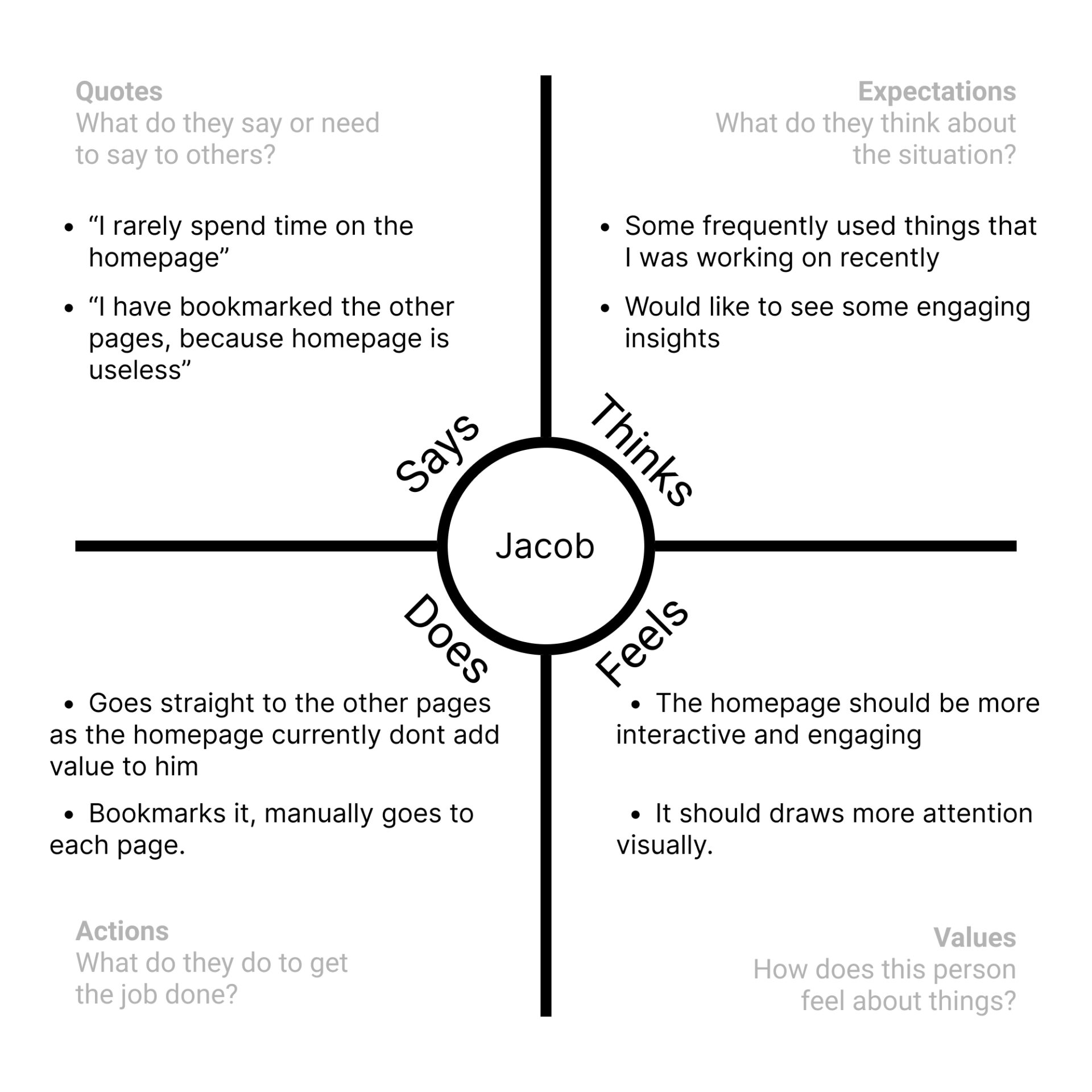
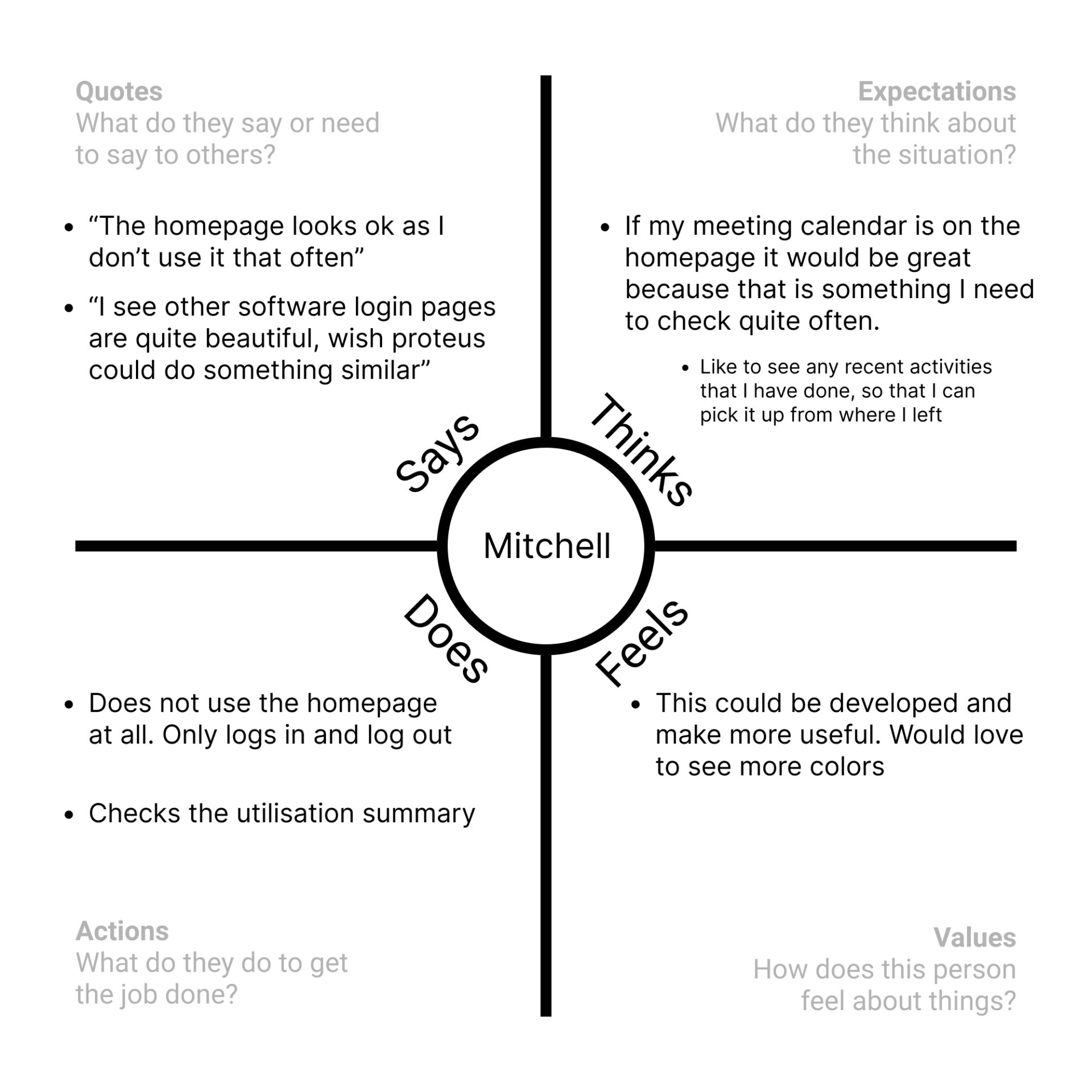
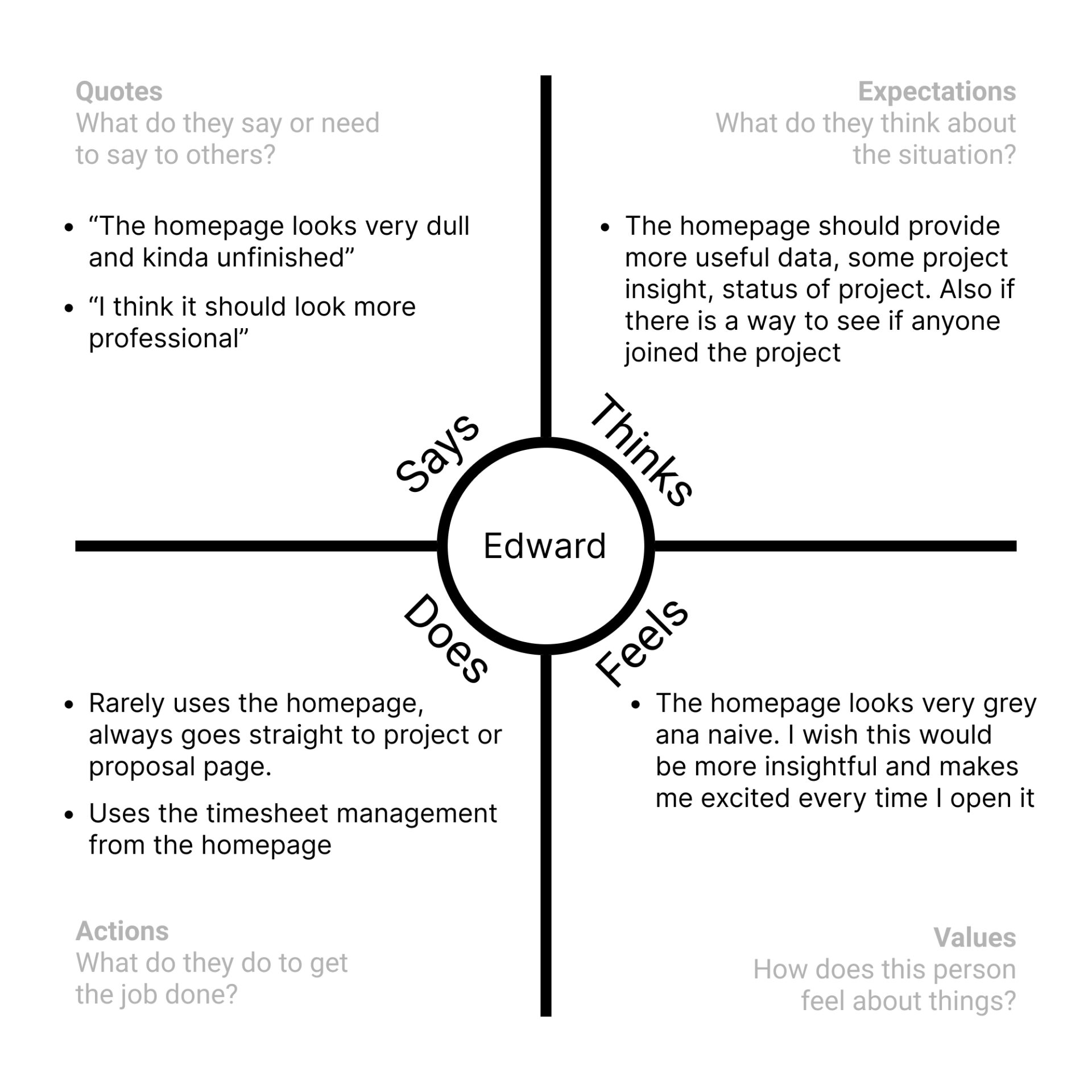
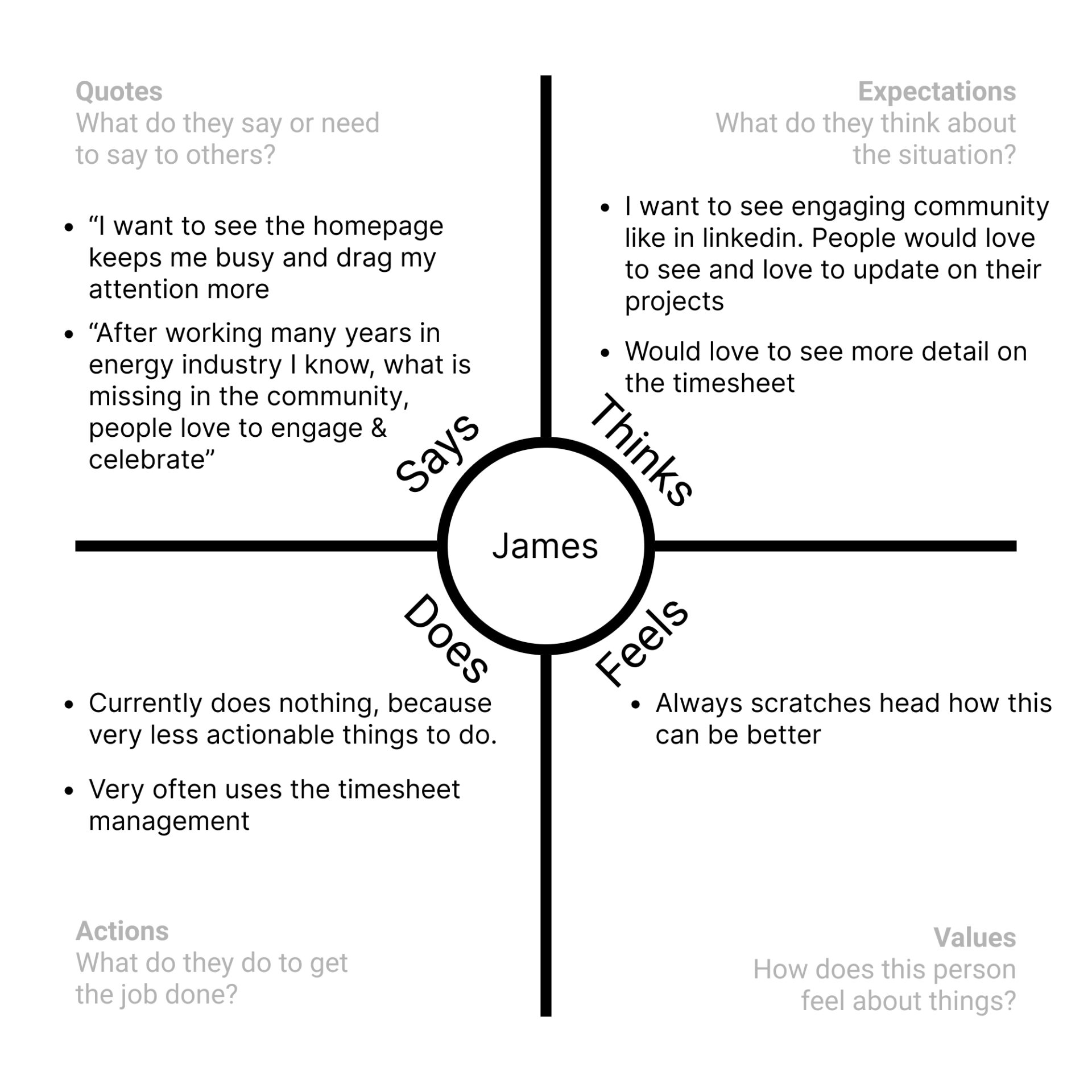
Empathy map
Pain points
After conducting the interviews few of the user pain points have been addressed.
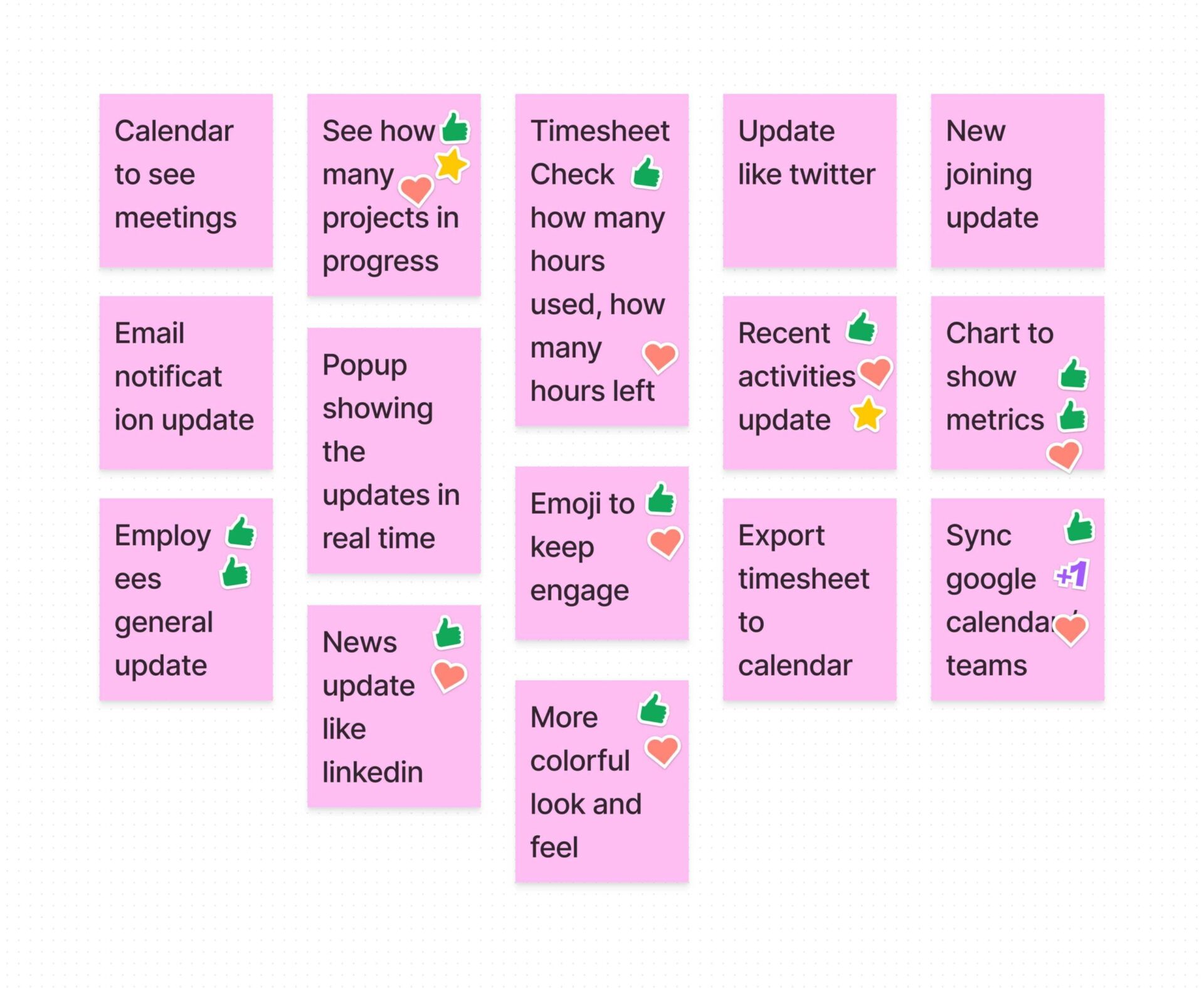
1. As a user I need features that will make my homepage more useful. 2. I want to see my homepage look more professional yet simple 3. I want to see more engaging features on my homepage that will always keep me updated
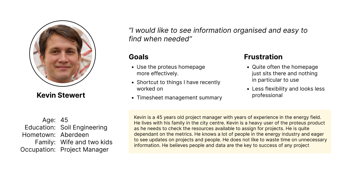
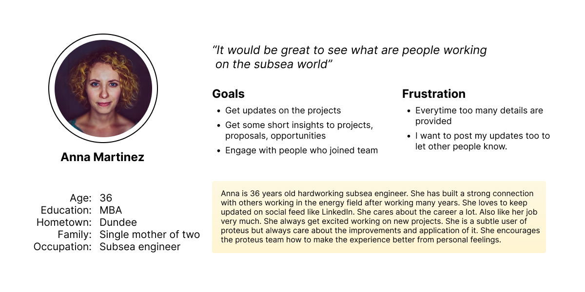
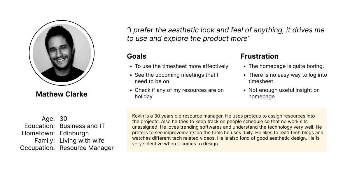
User personas
Based on our user group I have created the following personas which gave the team a real story experience. I took team’s opinion on the product user persona before building it. After building the persona I reviewed with the team
User story
The three user story that we can relate in are 1. As a regular user who spend a lot of time on proteus, I want to see the recent activities that I have worked on so that I can quickly access on what I was working on 2. As a subsea engineer who loves to keep updated, I want to see updates on projects and get insights so that I can get a summary of what has been happening 3. As a resource manager who is always inline with the industry news, I want to see a feed to recent news on projects and meeting schedule so that I can get engaged in network and get timely update on my meetings
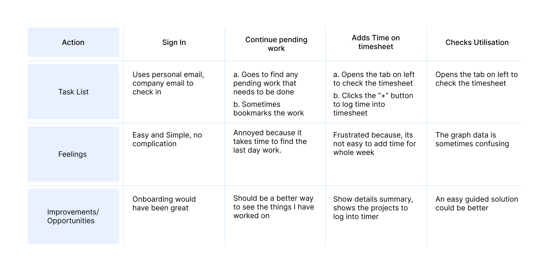
User journey
I created a user journey map just to understand the user’s actions at different stages. It helps to create an obstacle-free path for the users and identify improvement opportunities. As the homepage was in a state of redesign many features were needed at discovery.
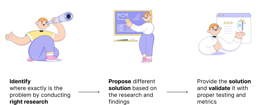
The solution
After the long-scheduled work on finding the problem and defining it, it was then come down to finding the solution. At first, I gathered some hypotheses to generate ideas in order to solve this. Later I linked the ideas to the personas to solve their problems
Hypothesis Statement
1. If Kevin logs in to proteus homepage then he would be able to see his recent activities and log time to the worksheet more effectively 2. If Anna logs in to proteus homepage then she would be able to find out some automated report built insights and get to know about people who joined any projects 3. If Matthew logs in to proteus homepage he should be able to use the timesheet in details and see his upcoming meeting that he needs to join.
Design Ideation
Considering the human factor
Though there were many things that were inline with the research outcome I had to keep in mind the human factor that often occur in user experience such as impatience, limited memory, needing analogies, limited concentration, needing motivation and making errors.
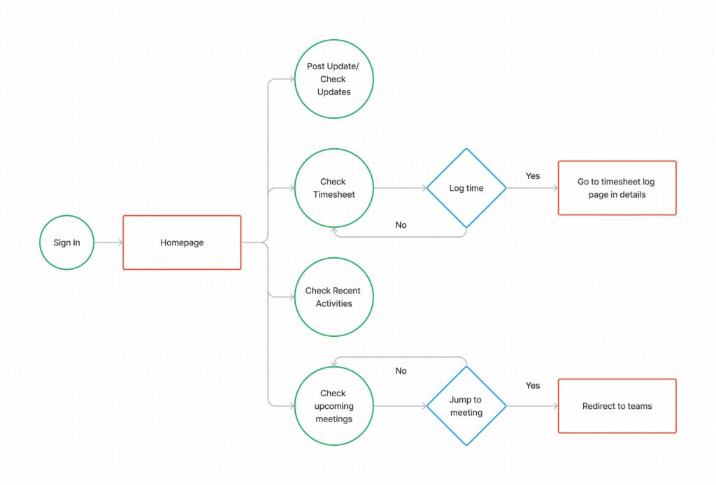
User flow
Before designing screens, to understand how users can effectively move through the journey overall, I created a user flow to under more on the following questions:
What actions will users take in the journey
What decisions will users make?
What screens will users experience after taking action or making a decision?
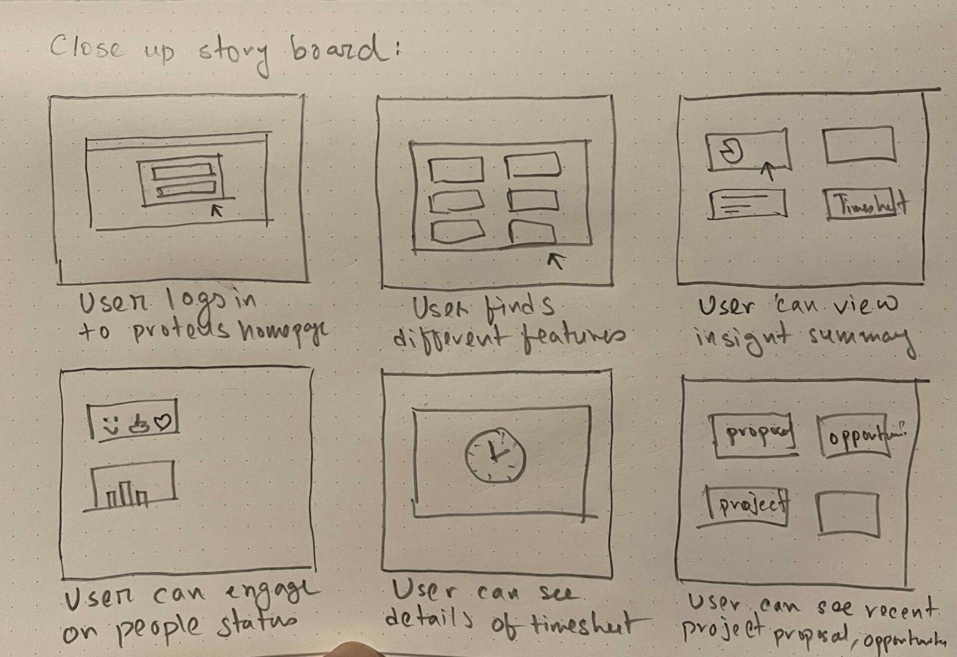
Close up story board
We have created a close-up storyboard to visually tell the story of a journey and experience how it will look like.
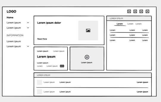
Wireframing
After getting feedback with my stakeholders and project manager I have decided to build the wireframe to give more look and feel of the initial look that I will propose. I made some research on site like behance, dribbble, real products page etc.
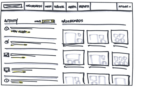
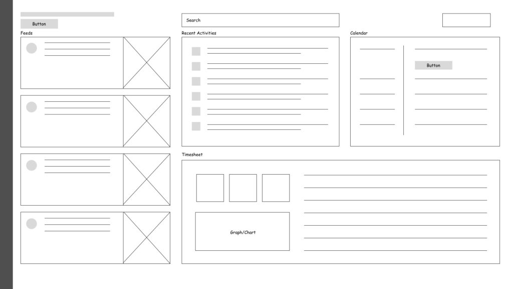
High fidelity prototype
After careful consideration on the user need and feedback from the team member from the wireframe and low fidelity prototype, I have tried to extract down to the high fidelity where we can have real feel and look of the finished product.
As we found out that timesheet management is one of the key feature that users frequently uses and are looking of, so I have decided to create another detailed page for the timesheet management vertical.
To cut time in the project development we have decided to use our existing design system visuals with updates on components. A brief detail on the design system that I have created for proteus can be found here: https://mahmud-khairul.com/design-system/
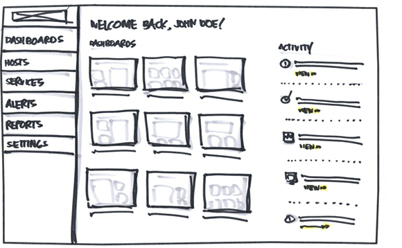
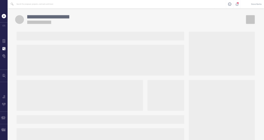
Old client homepage ☹️
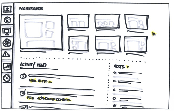
New client homepage 🤩
Design Analogy 🤔
The feed card section
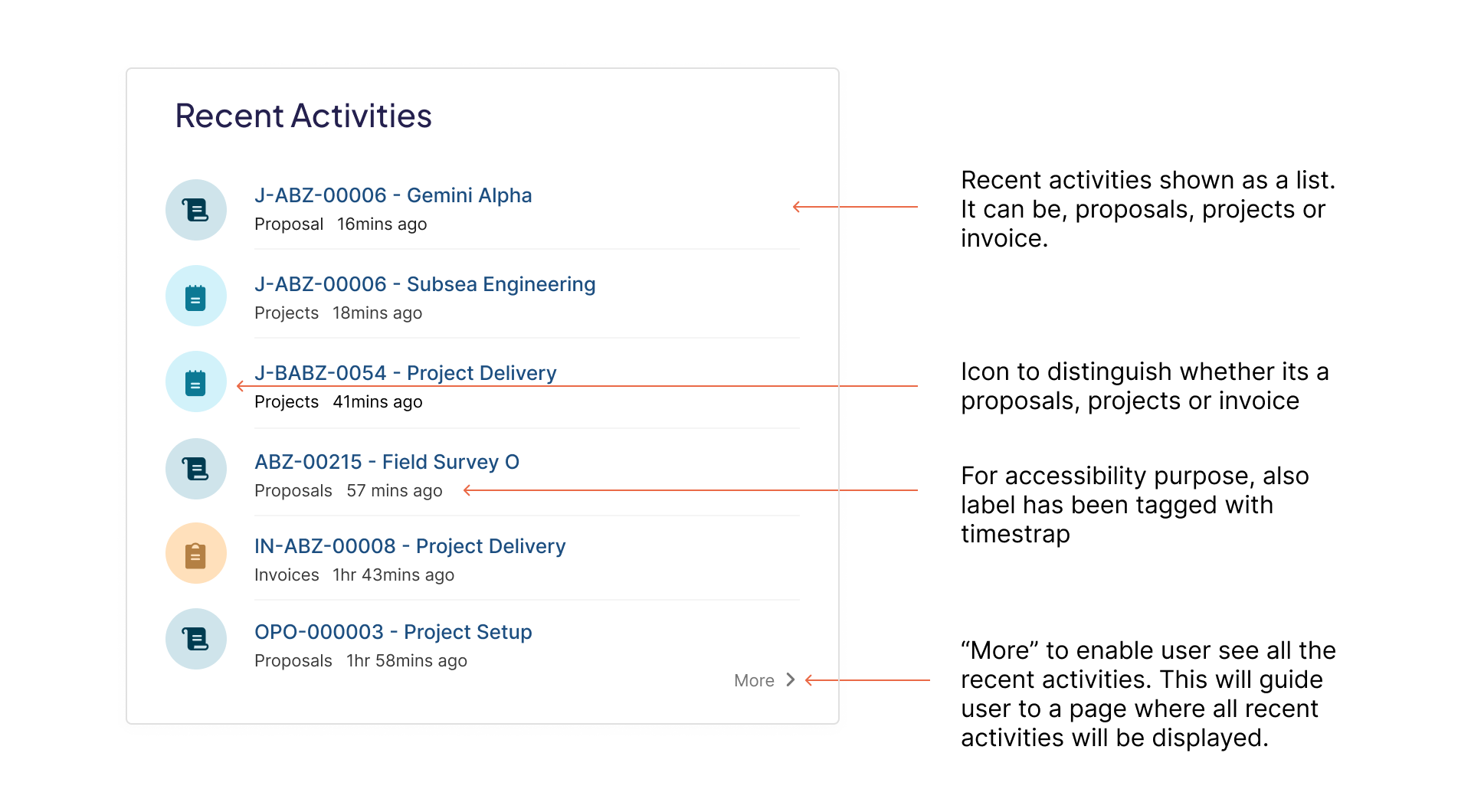
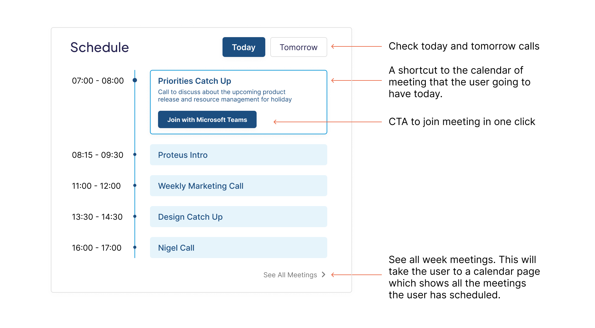
The recent activity section
The schedule activity section
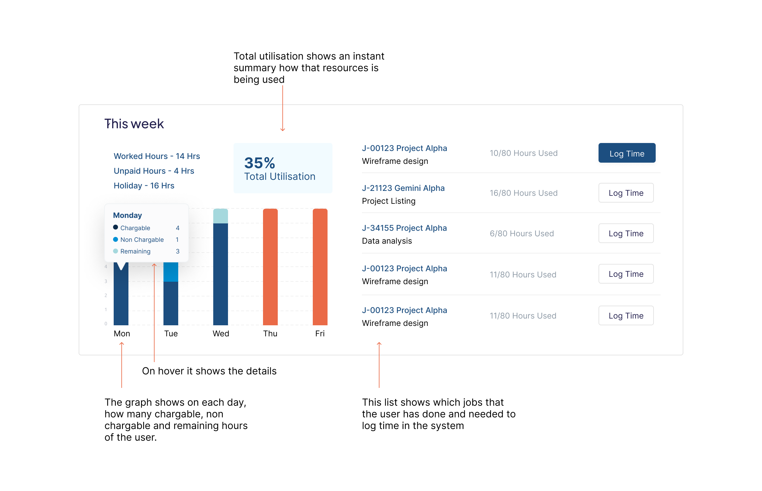
The time log graph section
Testing the product
In order to test the product we tested out beta version with some volunteer user group. The test was conducted based on questions that we created in prior. Few of the questions are provided below:
1. What is the first thing you see when you login to the homepage? 2. What is the first thing you do after entering the login page? 3. How do you feel about it? 4. Can you log in time for the project easily? 5. On a scale from 1-10 where 1 is difficult and 10 is extremely easy, how would you rate the overall experience?
Key Performance Metrics
1. Time on task: It measures how long it takes for a user to complete a task. Example: in our project I asked a user to post a status of a project update. 2. Use of navigation vs. search: It indicates the number of people who use the app’s navigation, compared to the number of people who use the search functionality. There is no right or wrong answer here, I tried to understand the nature, how many users uses the navigation and how many of jumps straight to search. 3. User error rates: Indicate the parts of a design that cause users to make errors. I tried to find out how many times the user clicks the wrong button or navigate the wrong area of the design or any of the design part is misleading to them. 4. Conversion rates: Any time a user successfully completes a task, meets a goal, or makes it to the final destination of your product, it’s a conversion. I tried to find out the ratio of a user completing a micro task and complete task. 5. System Usability Scale (SUS): Sets of questions that asks participants their opinions about your product. I set out questions to find out the overall experience of the design.
At first I listed down the KPI’s that I thought would be useful to achieve the goal. Here are those:
Conclusion
After one week of testing in various methodology we were satisfied to ship it to the developer team. This project was a great journey from research to ready-for-development. Through the project I have learned about the product more. Got to know about our user’s pain point more and understood how much value each small iteration adds.
Few key learning
1. Felt proud for the solution on nearly what was expected. Our clients were very excited. 2. If I had time I wanted to do more on components card and short animation 3. Learned that completion over perfection is always preferred
N.B. If this project seems interesting and you are keen to know more drop me an email at mahmud.khairul@gmail.com and I would love to share my practical experience which would benefit to your product journey.