Design System for Proteus

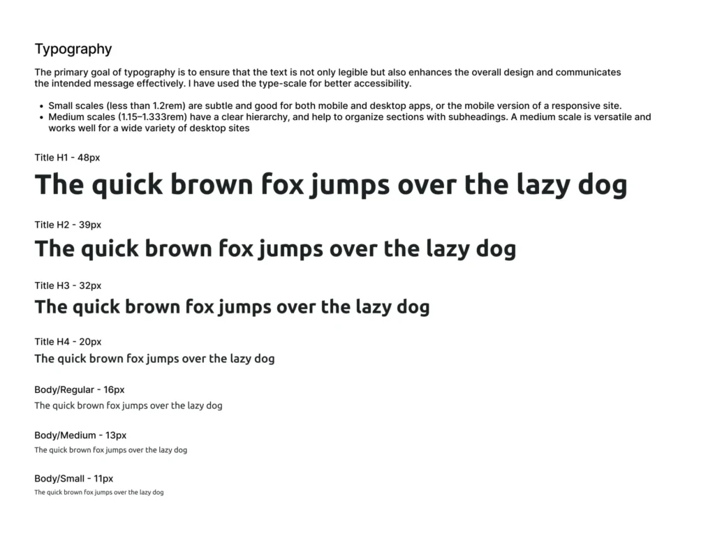
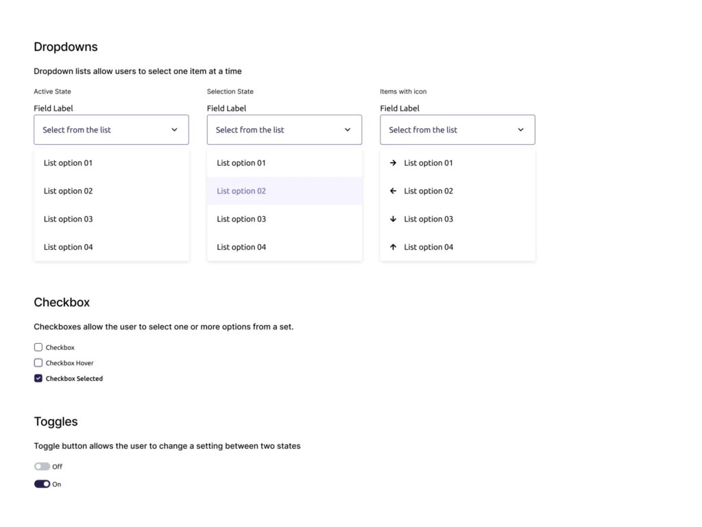
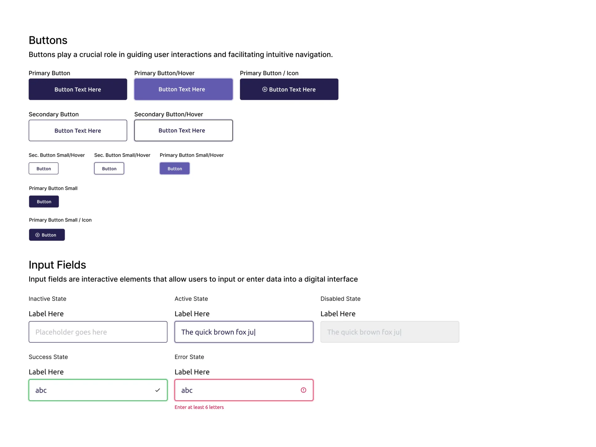
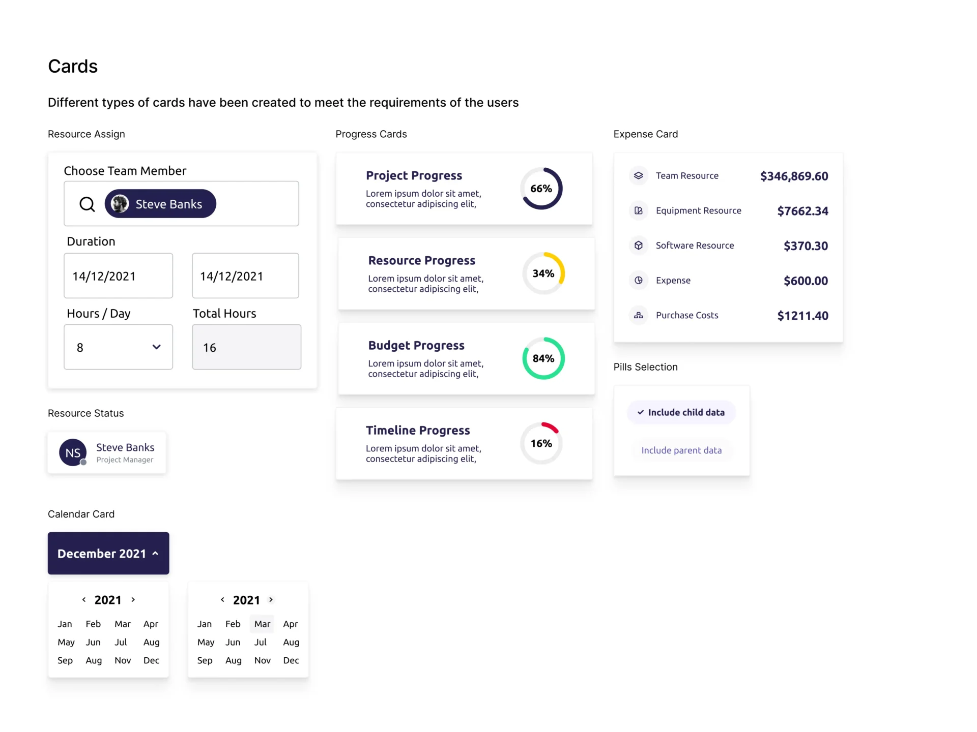
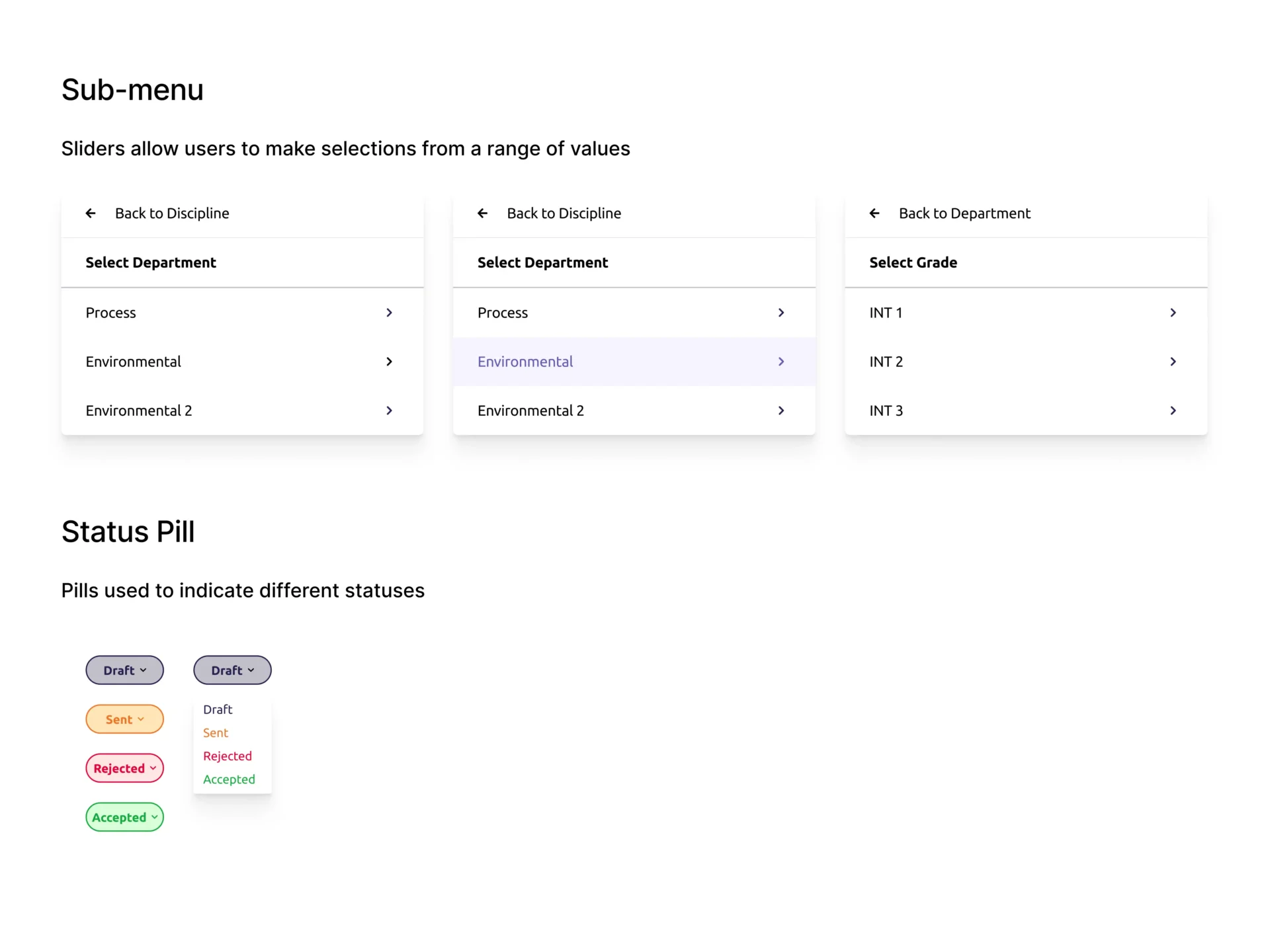
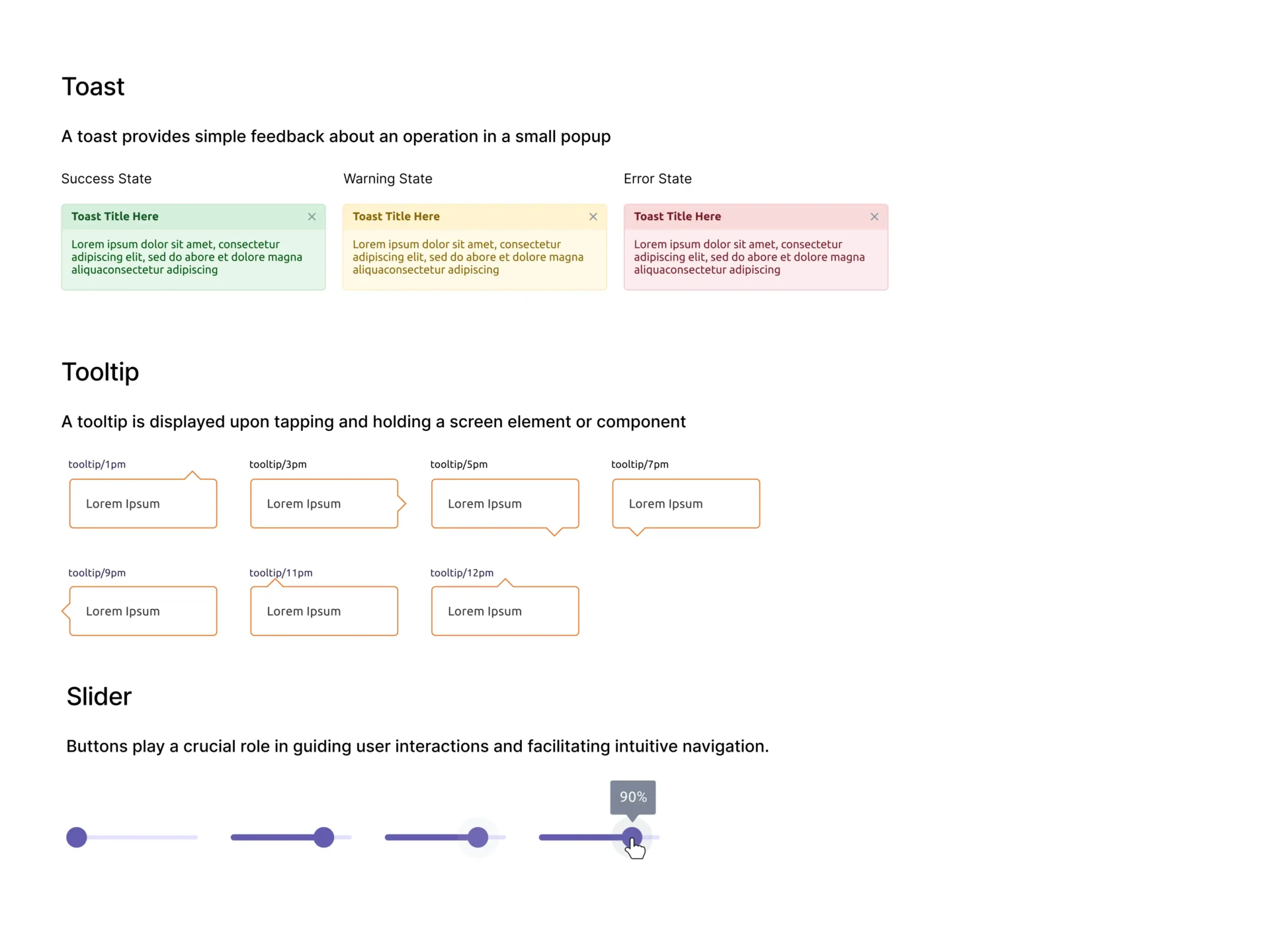
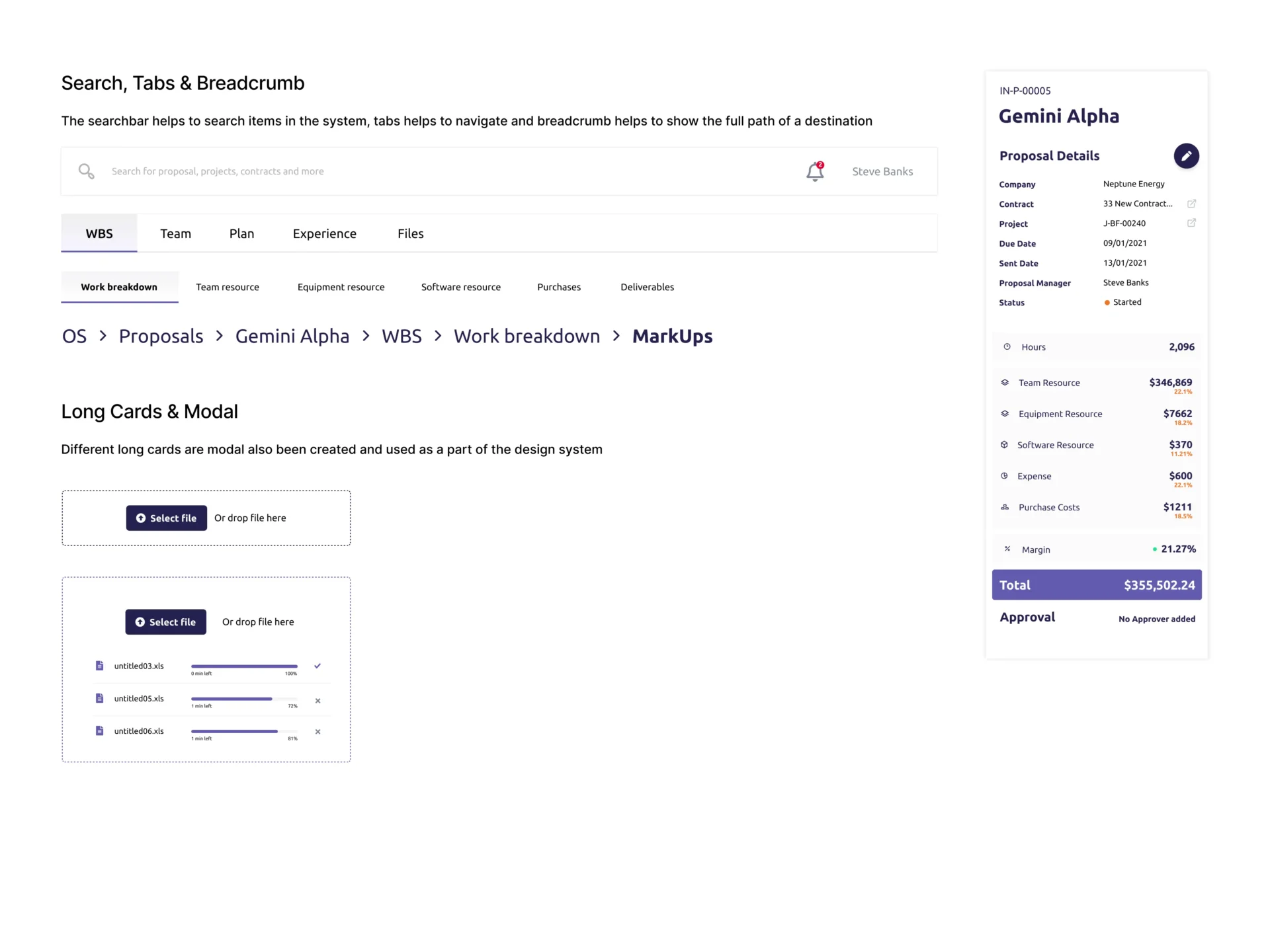
The design system for Proteus is built upon a set of core principles that guide the overall design approach. These principles emphasize clarity, simplicity, and user-centricity, ensuring a seamless and intuitive experience for all users. By adhering to these principles, Proteus maintains a consistent and recognizable identity while accommodating diverse user needs. 

The design system features a comprehensive component library that offers a wide range of reusable UI components tailored specifically for Proteus. These components, including buttons, forms, cards, and navigation elements. A preview of the design system is showcased below.

Fonts

Fonts

Dropdowns & Checkbox

Dropdowns and Checkboxes

Buttons

Cards

Sub-Menu

Toast, Tooltip ans Slider

Search Tabs, Modals and SideNav

Scroll to Top