Proteus - Project Management Software
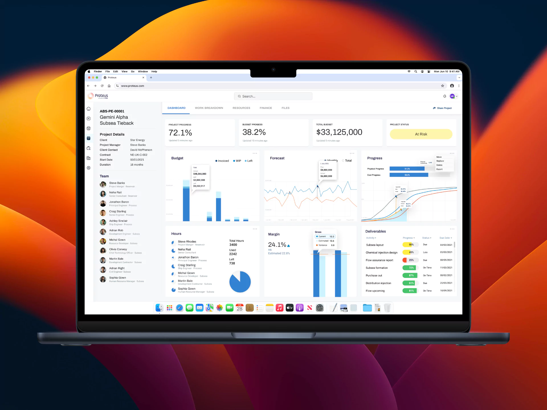
Proteus project management is a feature-rich software designed to meet the demands of complex projects, global teams, and ambitious targets by streamlining the way project teams work.
SaaS
Scotland, UK
Background
The Proteus project management software is equipped with powerful features designed to provide unparalleled visibility and control over complex projects. In the UK’s oil and gas sector, the software used is often cumbersome and tries to do too many things at once. Proteus addresses this issue by being a niche player in the industry, offering an accurate project planning software solution.
My Role
I was responsible for leading the complete product design and strategy. I collaborated closely with the chief technical officer and CEO to comprehend and develop the end-to-end journey of the software. Throughout the development process, I also worked closely with both the frontend and backend developers, as well as the quality assurance team.
Understanding the pain points with research
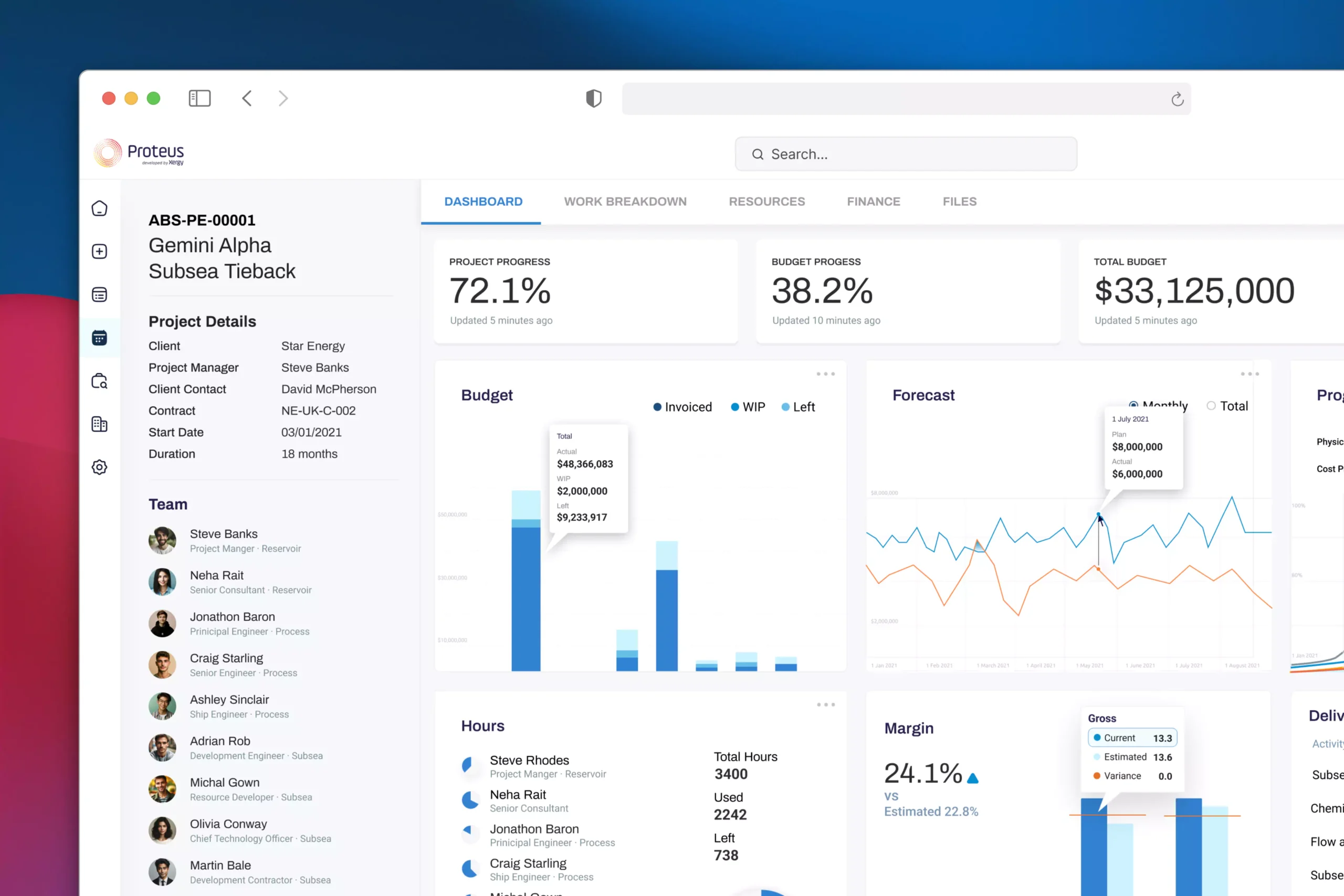
Creating the dashboard is not the hardest part to do in this task. Understanding the users what exactly they use frequently and how it will impact their daily work activity were the main essence of the project. We plan to keep things effective and easy to find yet extremely beautiful. Our plan was to make it desirable and lovable.
Crafting the details
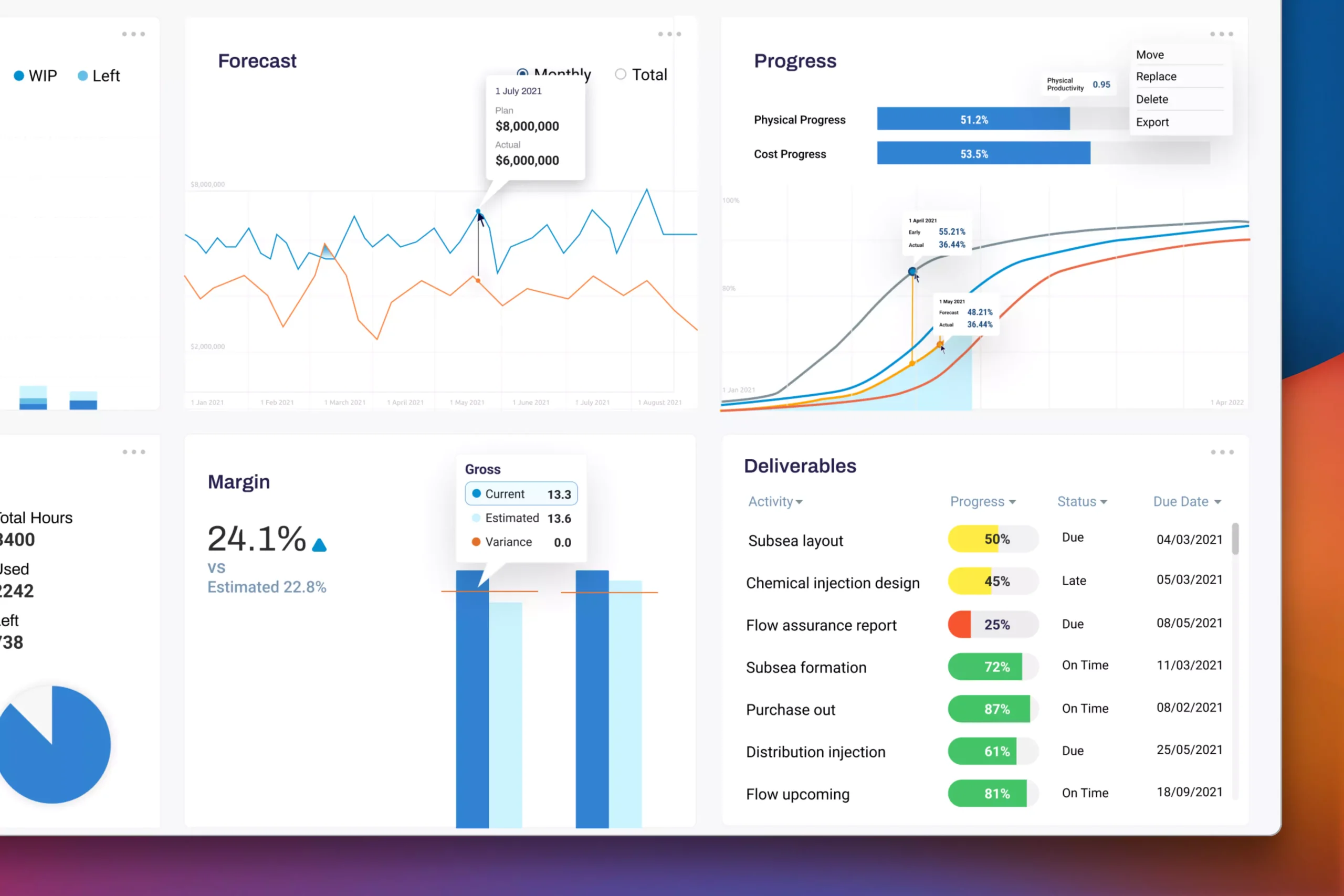
As the UX/UI designer of this project, my plan was to keep things as agile as possible. Users should not encounter any roadblocks; every question or concern they have needs to be addressed. We conducted research to find the most suitable chart, adjust the best colors, ensure accessibility, provide guidance at every step, and utilize accent colors. For example, on the Deliverables card, users will immediately understand which tasks are at risk.
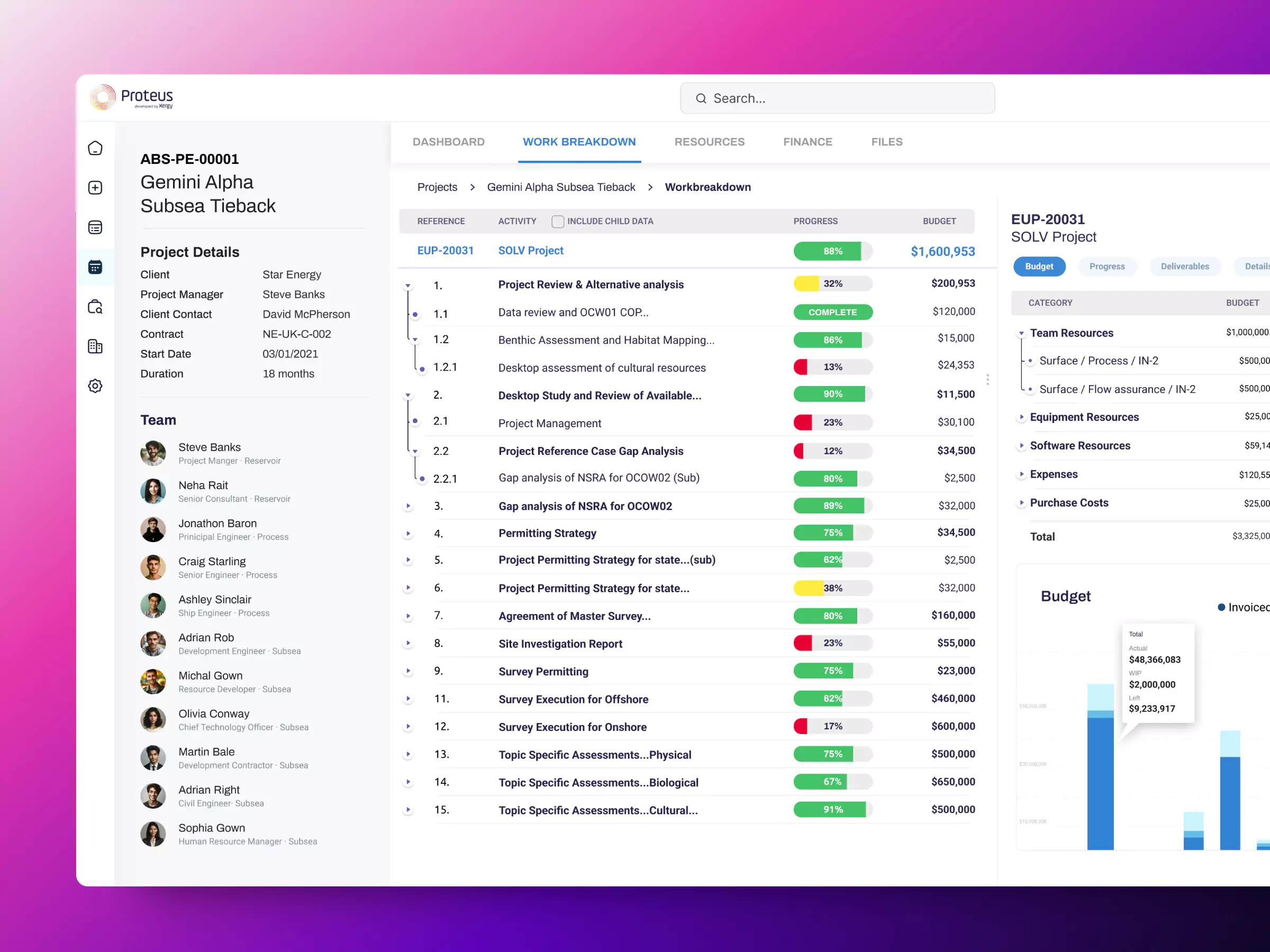
Breaking the work breakdown
I structured the entire UX design workflow into clear, actionable phases, detailing each component necessary for a successful website redesign. This WBS served as a roadmap, facilitating alignment across stakeholders and team members, and enabling efficient tracking of progress at each stage.
Connecting the dots
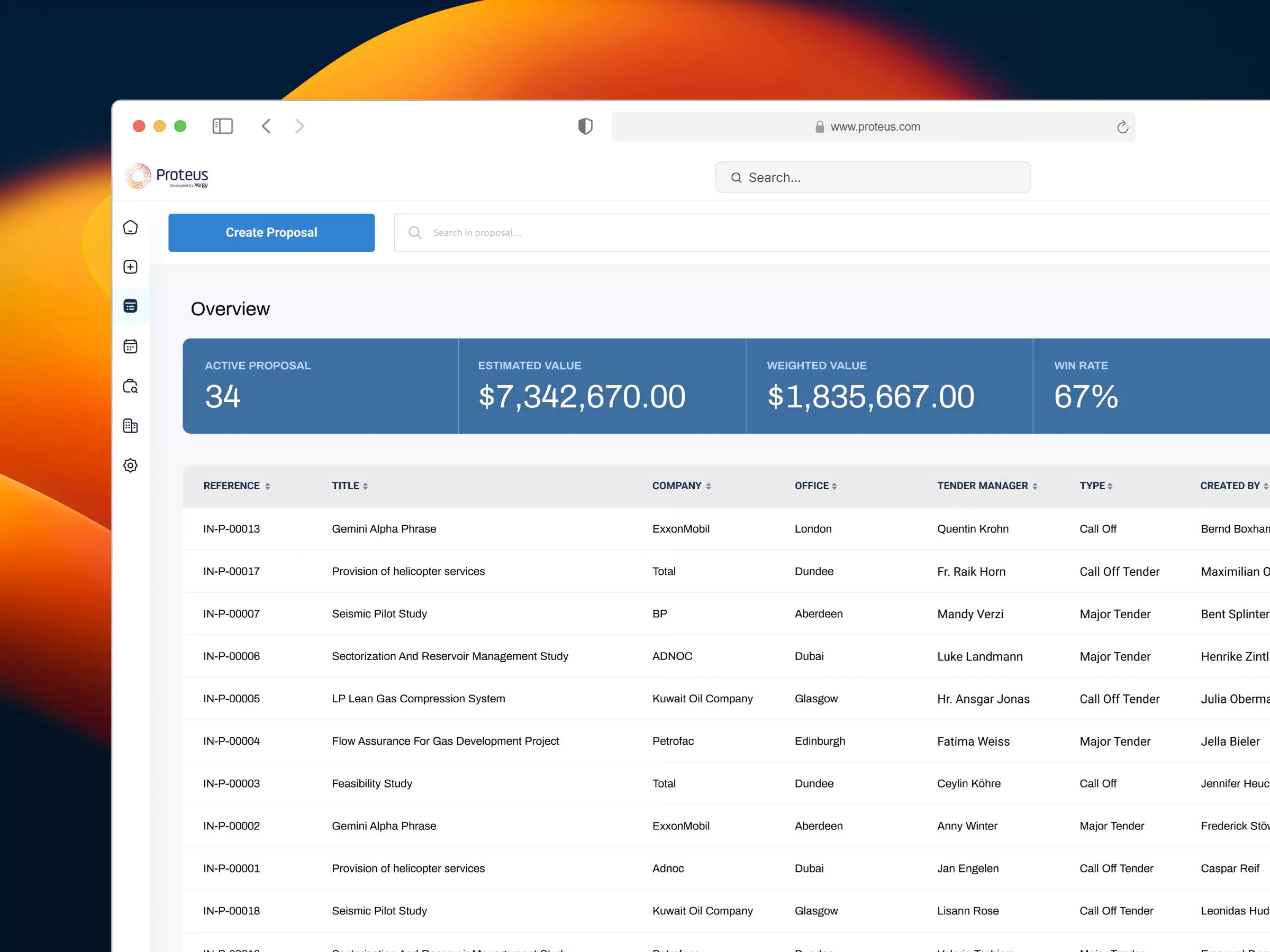
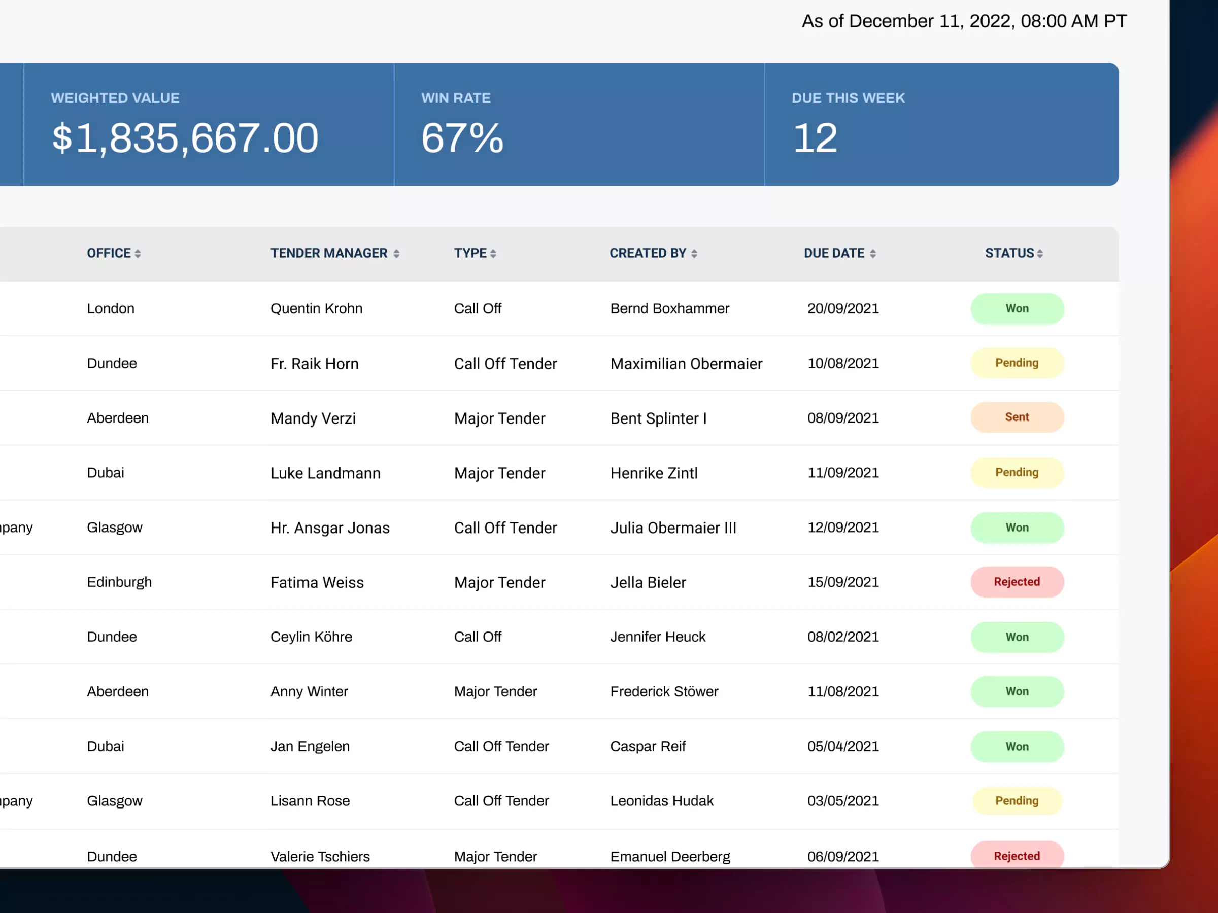
The main section features a list of all active proposals, each accompanied by a clear status indicator. Users can quickly scan through proposals, noting their current phase in the workflow, such as Won, Pending, Sent, or Rejected.
Positioned at the top of the page, this overview gives users a snapshot of all proposals, breaking down their current statuses. This summary helps users identify bottlenecks or priorities instantly, without the need for scrolling.
Realtime project's progress
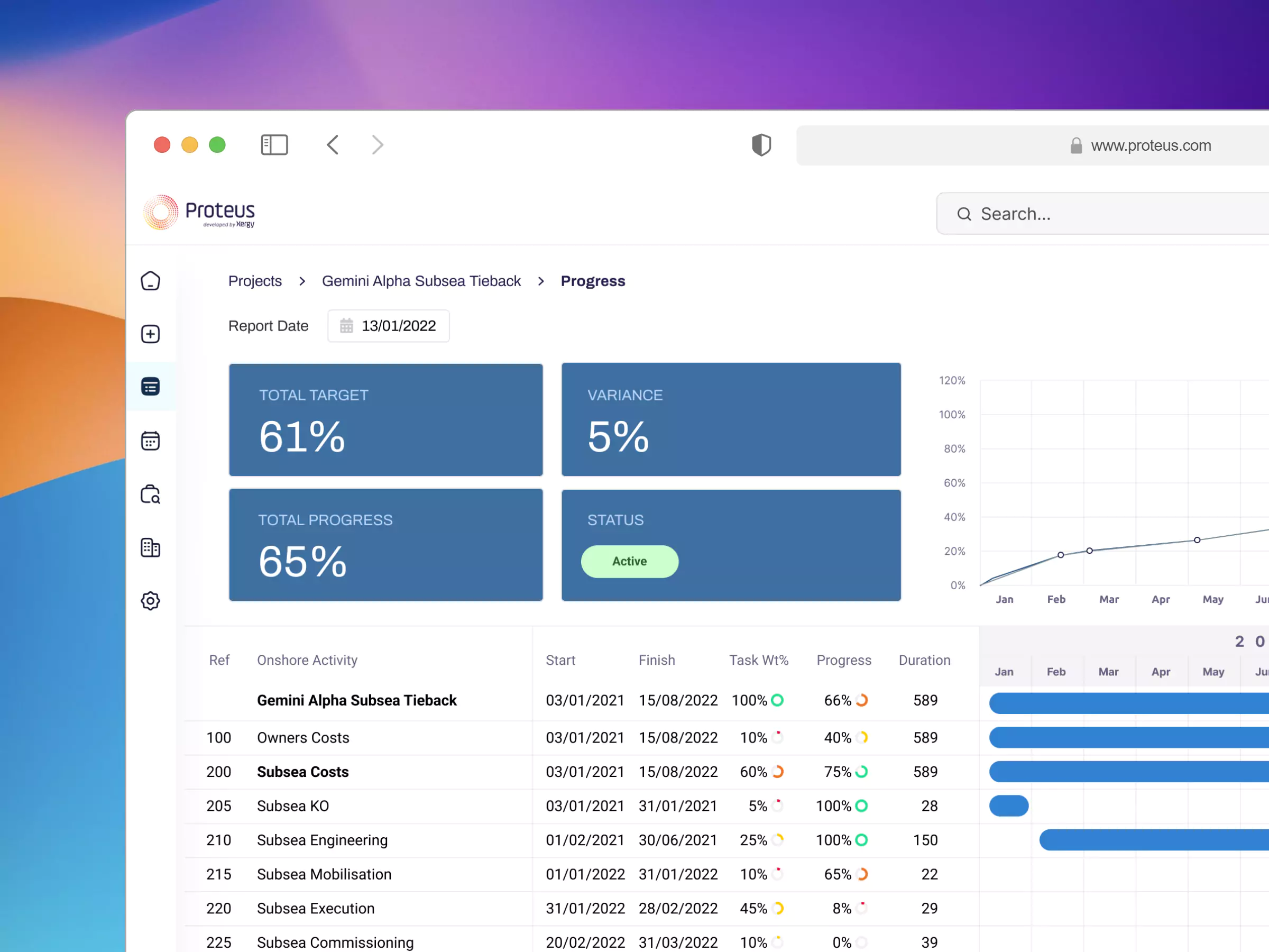
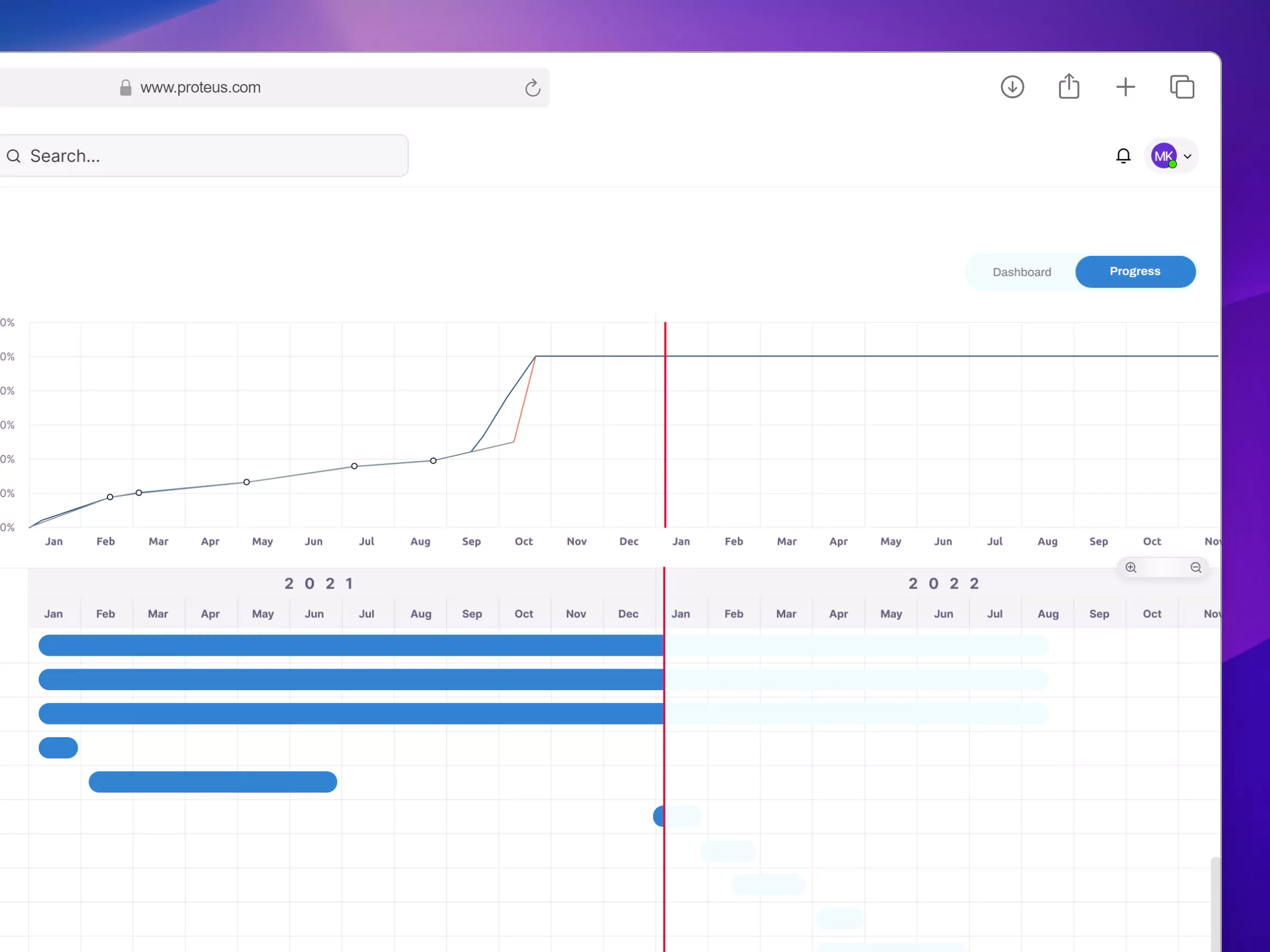
In line with enhancing project visibility and user’s requirement, I created a Progress Page that features an interactive Gantt chart, providing a dynamic view of the project’s Work Breakdown Structure. This page enables users to monitor the status of each task in real-time, with a focus on timeline and performance.
Key Challenges
Developing the design for this project presented several unique challenges, requiring an innovative and adaptive approach to achieve the desired outcomes. Starting from scratch, I was tasked with not only building a design that would be effective and user-friendly but also with defining the foundational structure and approach that would drive the project forward. Without predefined design guidelines, I had to adopt an organizational approach, diving deep into the project’s goals and aligning them with the user experience.
One of the primary challenges was conducting user research with clients from the oil and energy sector—an industry I initially had limited familiarity with. To bridge this gap, I undertook extensive research to understand the specific needs and operational contexts of these clients.
Throughout this process, collaboration with colleagues was essential. Their expertise and industry insights helped me navigate unfamiliar territory and broaden my understanding, making it possible to develop a design that resonated with our clients. By integrating their feedback and continuously iterating on the design, I was able to deliver a user experience that met the high standards expected in this sector.
Key Takeaways
If you’re the sole designer in a small company with a product still in its early stages, it is essential to understand the user journey again and again. Also if the platform contains a lot of data, it is necessary to understand how the users uses the data. And UI kits, tokens, and patterns—may not be essential yet. Investing time in updating a comprehensive design system before the product is fully established may not be the best use of resources. Instead, focus on developing an initial UI kit, which will save time for both you and the developers as you move forward.
The research on the competitor cycle should not stop. Designer must keep an eye on the competitor regularly to get gey insights on design.
Data visualization is different from creating a landing page. It requires intensive research. It’s better not to jump into design and instead spend enough time on research. Make multiple sketches to plan out which data you want to show and how you want to show it. Continuous discussion with your product manager will save a lot of time.

