Dayshape's Bulk Feature A/B Test
Background
A significant number of users of Dayshape requested an approach to carry forward task of a fiscal year to another by shortest possible interactions. Each task is called an engagement. This request was one of the top priority from the customer success team The most time-effective method to create Engagements and Engagement Groups as templates for new work that is planned for the new financial year is to roll forward similar prior year Engagements and Engagement Groups.
My role
I led the feature design, strategy and testing. I was responsible for creating the entire end-to-end service design for this feature in close collaboration with the development team. I was also responsible for post-launch design support, research and product enhancement.
Solution
The goal was to design and test the feature by taking the A/B testing approach to validate and find out which approach works the best before launching
The Users and the Need
The A/B Testing Approach
After designing the interface, the goal was to test the feature to determine which design perform better. We took the design and tested with 50 users. We send the designs into two groups. Design A to Group A and Design B to Group B.
The KPI
We set some Key Performance Indicator (KPI) metrics for the task we will be assigning to the users.
1. Time on task
2. Use of navigation vs. search
3. User error rates
4. Conversion rates
The Test
Here are some of the screenshots of the A/B test that was conducted. For the NDA purpose I am only showing the images which I am allowed to.
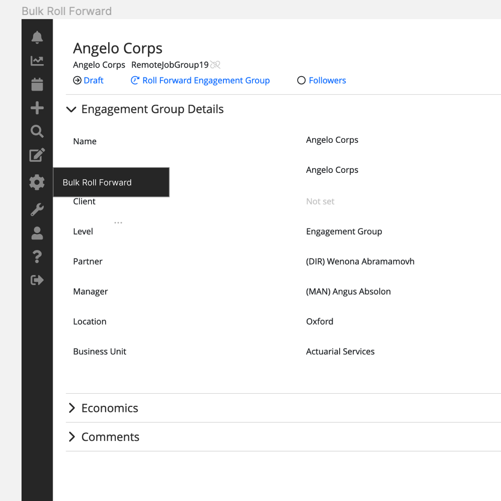
Test 1 Design A - Entry point at the navigaton primary step.
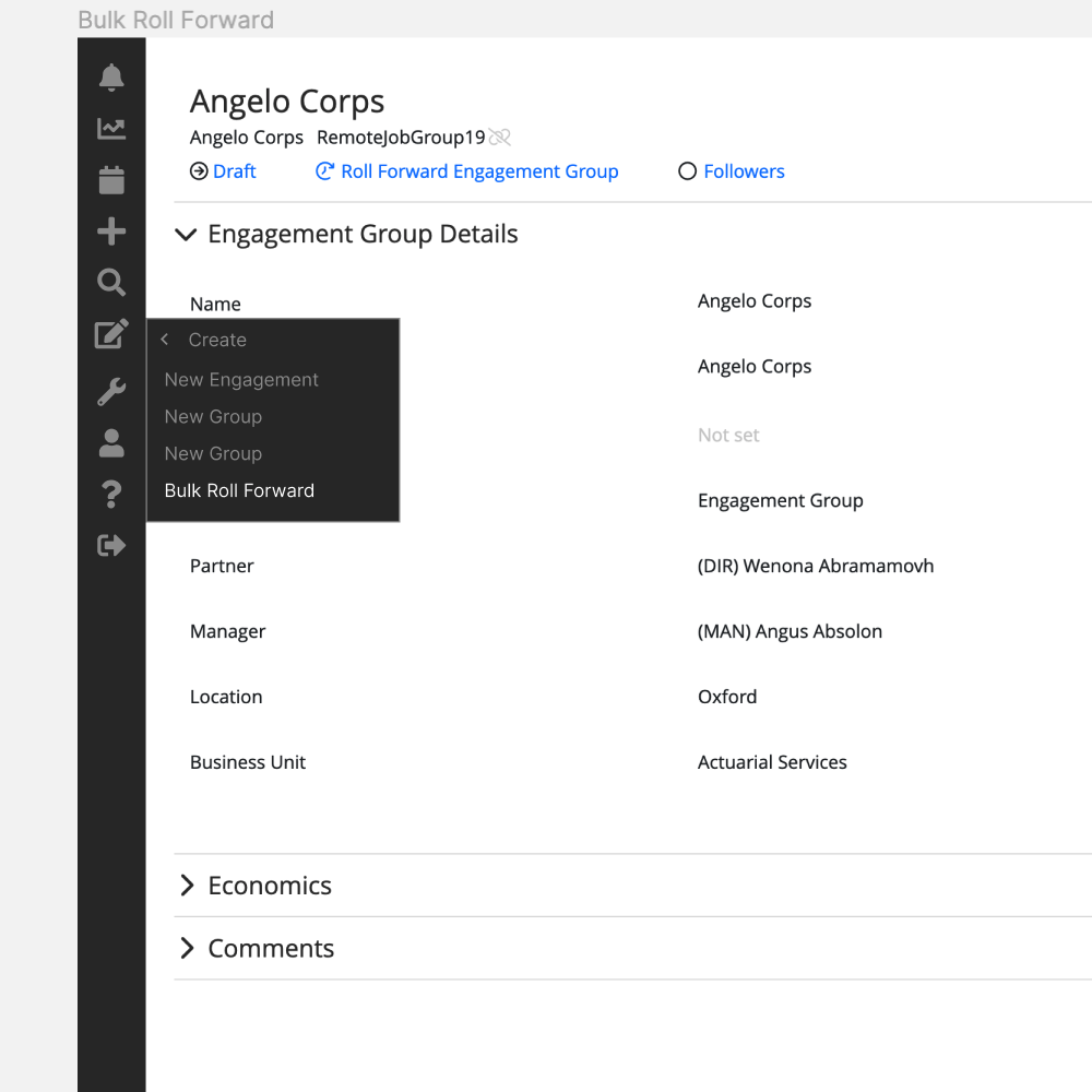
Test 1 Design B - Entry point at the navigation secondary step ✅ ✅
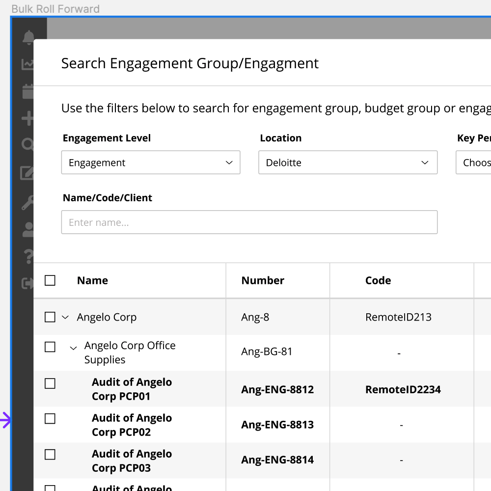
Test 2 Design A - Engagement level as a drop down ✅ ✅
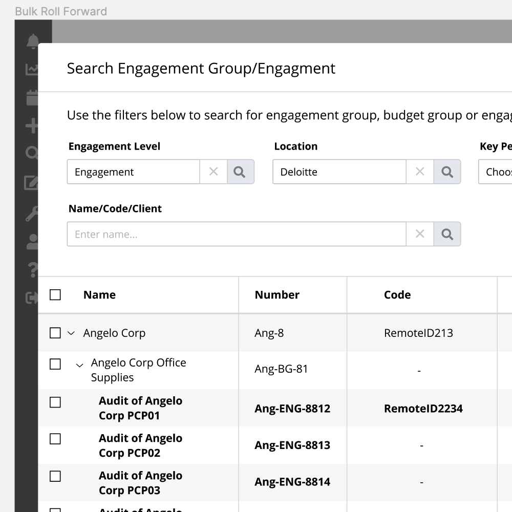
Test 2 Design B - Engagement level as a search with detail filter
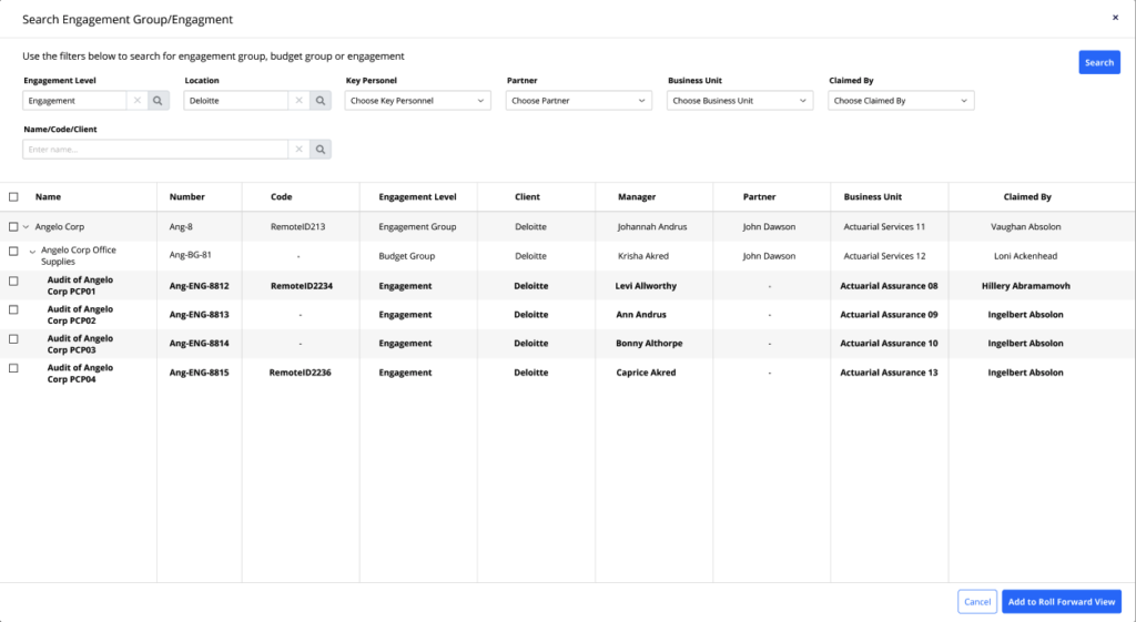
Test 3 Design A - Search button on the bottom left
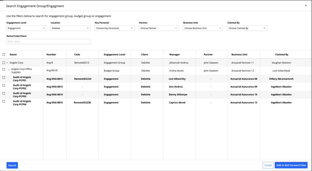
Test 3 Design B - Search button on the top right ✅ ✅
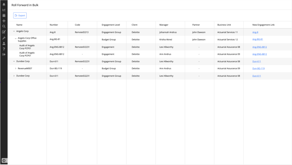
Test 4 Design A - Completion shown on the same page
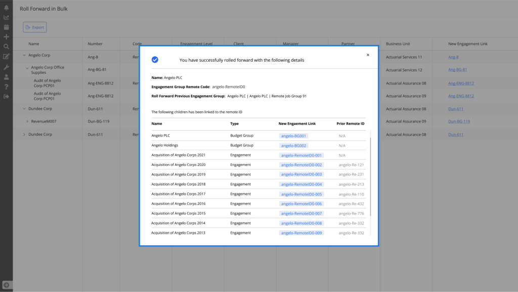
Test 3 Design B - Completion shown on a popup window with detail confirmation ✅ ✅
The Learning
– A greater learning was that we can test everything does not mean that we should test everything. It is wise to test the feature which will provide maximum value to the user and to the business.
– Change only one variable at one time.
– Measure their behaviour to understand why they prefer one than the other.
– This test helped to understand which area of the page gets most attention.
– Need more understanding on the sample size of the user. I was not 100% confident what would be an ideal number of users.
– Though this feature was top priority and we had to rush on few decisions, it is ideal to give enough time for the test.
– Consider the state of the design. User’s point of view and expectation would be different.
– Tools like optimizely, hotjar will help to do the testing in a faster way. So need to be more efficient using those.
